
.jpg) Mira Gwehn Revilla
Mira Gwehn Revilla
Case Study: 40% Patient Satisfaction Boost with Curogram
💡 Family Care Center, an 8-provider family medicine practice in Denver, raised patient satisfaction scores by 40% after switching from...

Most practices spend time and money on patient outreach. But few ever stop to ask: is it working?
Without clear patient communication metrics, you are flying blind. You might send hundreds of reminders each week and still deal with high no-show rates. You might think patients are happy, but never check the data behind that feeling.
Here is the truth: Practices that track and act on their numbers see real results. Based on our internal data, one clinic cut no-show rates from 14.20% to 4.91% in just three months. Another saw over 1,100 confirmed appointments per month after putting the right tools in place.
This guide walks you through every KPI that matters for your practice. You will learn which patient engagement metrics to watch, how to measure patient satisfaction KPIs, and where to find quick wins. We will cover clinical outcomes, channel performance, and how to build a dashboard that drives real change.
Whether you run a small family practice or a large multi-location group, the right numbers tell you exactly where to focus. Let's dig in.
There is an old saying in business: what gets measured gets improved. That is just as true in healthcare. If you do not track how well your practice talks to patients, you cannot know what needs to change.
Measuring communication effectiveness helps you prove the ROI of every dollar you spend on outreach tools. Think of it this way. If you invest in a new texting platform, you need hard numbers to show it was worth it. Patient communication metrics give you that proof.
Beyond ROI, tracking these numbers helps you find weak spots. Maybe your emails go unread but your texts get replies within minutes. Maybe new patients respond at half the rate of loyal ones. Without data, you would never catch these gaps.
There is also a quality and compliance angle. Many payers and quality programs now tie payment to patient experience metrics. If you cannot show strong scores, you risk lower payments and missed bonuses. Groups like CMS look at things like patient feedback and follow-up rates as part of value-based care models.
Finally, good data lets you set clear goals. Instead of saying "let's do better," you can say "let's raise our confirmation rate from 65% to 75% this quarter." That kind of target gives your team something real to aim for.
Healthcare communication analytics turn vague ideas into clear next steps. They show your team what is working, what is not, and where to put their energy. That is why measuring communication should be a core part of how you run your practice.
Before you can improve, you need to know what to track. These are the key numbers that show how well your messages reach and engage patients:
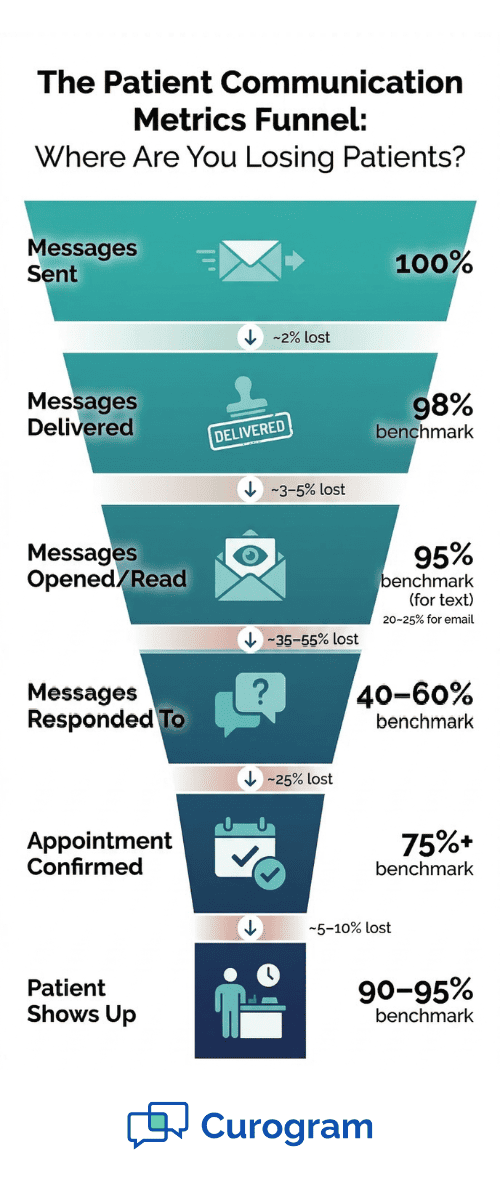
This is the starting point. Your delivery rate tells you what share of messages actually land in a patient's inbox or phone.
A strong target is 98% or higher for text messages. If your rate drops below that, you likely have outdated phone numbers in your system. Run a quick audit of your contact list every quarter to keep this number high.
Delivery means nothing if no one reads the message. Text messages have an open rate near 98%, which is far higher than email.
Based on our internal research, practices that shift outreach to text see a major jump in patient engagement metrics. Track open rates by channel so you know where patients pay attention.
This tells you how many patients reply when you ask them to. For example, if you send a message asking patients to confirm or cancel, what share actually responds?
A good benchmark is 40–60% for text-based two-way messages. Low response rates often mean your message is too long or unclear.
This is one of the most important numbers for your bottom line. Based on our internal data,
Curogram clients see an average appointment confirmation rate above 75%, all through fully automated reminders. A high confirmation rate means fewer gaps in your schedule and more revenue per day.
If your practice uses a patient portal, track how many patients have activated their accounts and how often they log in. Low activation often signals that the sign-up process is too hard or patients do not see the value.
|
Metric |
Strong Benchmark |
Warning Sign |
|
Message Delivery Rate |
98%+ |
Below 95% |
|
Text Open Rate |
95%+ |
Below 85% |
|
Two-Way Response Rate |
40–60% |
Below 30% |
|
Appointment Confirmation Rate |
75%+ |
Below 60% |
|
Portal Activation Rate |
50%+ |
Below 25% |
Use this table as a quick guide to see where your practice stands today.
Satisfied patients stay longer, refer friends, and leave better reviews. But "happy" is difficult to measure unless you use the right patient satisfaction KPIs.
After key touchpoints — like a visit or a billing question — ask patients to rate their experience. A simple 1–5 scale works well.
Focus the question on how easy it was to communicate with your office. Keep surveys short. Two or three questions get far more replies than a 20-question form.
NPS asks one question: "How likely are you to recommend us to a friend?" Patients answer on a 0–10 scale.
Scores of 9–10 are "promoters," 7–8 are "passive," and 0–6 are "detractors." Subtract the detractor share from the promoter share to get your NPS. A score above 50 is strong for healthcare.
Track the number and type of complaints you get each month. Common themes might include long hold times, missed call-backs, or confusing messages. This data helps you spot patterns that surveys might miss.
Your Google and Yelp reviews are a goldmine of feedback. Look for reviews that mention wait times, staff friendliness, or ease of reaching the office.
Based on our internal data, one multi-location practice earned 1,064 new 5-star Google reviews in just three months by using automated post-visit surveys. Those reviews are both a satisfaction signal and a growth engine.
Send surveys within 24 hours of a visit while the experience is still fresh. Keep them to 2–3 questions max. Rotate questions each quarter so you cover different topics over time. A short, timely survey beats a long one that patients never finish.
Communication effectiveness measurement in satisfaction is not about one big annual survey. It is about steady, small check-ins that give you a real-time pulse on how patients feel.
The end goal of good patient communication is better health outcomes. These metrics link your outreach efforts to real clinical results.
No-shows cost the average practice thousands of dollars each year. This is where strong communication pays off fast.
Based on our internal research, practices using automated reminders and two-way texting see no-show rates that are 53% lower than the industry average. One clinic, Atlas Medical Center, dropped from 14.20% to 4.91% — three times better than the national average.
When patients take their meds on time, outcomes improve and costs go down. If your system tracks prescription refill data, tie that to your communication efforts.
For example, did a refill reminder text lead to more on-time pickups? Even a rough before-and-after comparison gives useful insight.
Track how many patients finish their annual screenings, vaccines, or wellness visits. Recall messages can make a big difference here.
Based on our internal data, 35% of patients who received an SMS recall scheduled a follow-up within one month — and 1,240 patients were seen from recall messages alone.
Fewer ER visits and hospital readmissions often point to better outreach and follow-up. If you communicate clear post-visit care plans through text or portal messages, patients are more likely to manage their health at home.
These clinical numbers do not live in a vacuum. When you improve communication, you create a chain reaction. More confirmed visits lead to better chronic disease management.
Better follow-up leads to fewer ER trips. It all connects. Tracking patient experience metrics alongside clinical data shows that connection clearly.
Good communication does not just help patients — it helps your team work smarter. These metrics show the impact on daily operations.
One of the clearest signs that your communication tools are working is a drop in phone calls. Based on our internal research, practices using two-way texting can reduce phone call volumes by as much as 50%. Track total inbound calls each month and look for a downward trend after you launch new outreach tools.
How many hours per week does your front desk spend on phone calls, voicemails, and follow-ups? Estimate this before and after you make changes.
Even a rough time study reveals savings. For example, if you free up two hours per day, that is ten hours per week your staff can use for other tasks.
Set a target for how fast your office replies to patient messages. For texts, aim for under 30 minutes during business hours. For portal messages or emails, same-day replies are a solid goal. Track your actual response times and flag any gaps.
This measures how often a patient's question or issue is solved in a single interaction. A high rate means less back-and-forth, fewer frustrated patients, and less wasted staff time. If your first-contact rate is low, look at whether your team has the info they need to answer questions quickly.
Add up your total outreach costs — software, staff time, postage, and phone bills. Divide by the number of active patients.
This gives you a cost-per-patient figure you can track over time. The goal is to see this number shrink as you shift to more efficient channels like texting.
Compare the cost of your tools to the revenue they help protect. For example, if automated reminders save 20 appointments per week from becoming no-shows, and each visit is worth $150, that is $3,000 per week in saved revenue. Healthcare communication analytics make this kind of ROI math simple and clear.

Not all channels perform the same. Tracking each one helps you put your effort where it works best.
Text is the highest-performing channel for most practices. Track delivery rate, read rate, and response rate. With open rates near 98%, text is hard to beat for time-sensitive messages like appointment reminders and confirmations.
Based on our internal data, Curogram clients see over 75% confirmation rates through automated texting alone.
Email works well for longer messages like newsletters, lab results, or billing statements. Track open rate and click rate. A good open rate for healthcare emails is around 20–25%. If yours is lower, look at your subject lines and send times.
Monitor activation rate, login frequency, and which features patients use most. If patients log in but skip the messaging feature, that is a sign the tool may not be user-friendly. Portals are great for secure document sharing, but they often lag behind text for quick, real-time communication.
Track answer rate, average hold time, and call-back rate. Phone is still vital for complex issues, but if your hold times are long, patients will look for other ways to reach you — or leave for another practice.
Build a simple side-by-side table each quarter to see how channels stack up.
|
Channel |
Open/Answer Rate |
Response Rate |
Best Use Case |
|
Text |
95–98% |
40–60% |
Reminders, confirmations |
|
|
20–25% |
5–10% |
Newsletters, billing info |
|
Portal |
Varies |
10–20% |
Documents, lab results |
|
Phone |
70–85% |
N/A |
Complex questions, urgent needs |
This quick snapshot helps you decide where to invest more and where to pull back.
A single set of averages can hide big differences across your patient base. Breaking data into segments gives you a much clearer picture.
Younger patients tend to prefer text and portal messages. Older patients may still lean on phone calls, though text adoption among seniors is rising fast.
Track your response rates by age group so you can tailor your approach. For tips on reaching older patients through the right channels, check out our guide on effective communication with elderly patients.
Patients with chronic conditions need more frequent touchpoints — reminders for refills, lab work, and regular check-ups.
Their engagement rates with ongoing messages should be higher than those of patients who visit once for an acute issue. If not, your messaging cadence may need a reset.
New patients often have lower engagement because they have not built trust with your practice yet.
Compare confirmation rates, portal activation, and survey responses between new and long-term patients. If new patient engagement is weak, focus on your onboarding flow — the first few touchpoints set the tone for the whole relationship.
For patients at higher risk of complications, track engagement even more closely. Are they opening your follow-up messages? Are they showing up for their appointments? If a high-risk patient goes silent, that is a red flag worth acting on fast.
Look for groups with low response rates or high no-show rates. These are patients who are falling through the cracks.
Sometimes, the fix is as simple as switching the channel — moving from email to text, for example. Other times, you may need to adjust the message itself or the language it is written in.
Segmenting your data turns patient engagement metrics from a blurry average into a sharp, useful tool.

Tracking numbers is only useful if you can see them clearly and act on them. A well-built dashboard brings all your data into one view.
You do not need to track everything at once. Start with five to seven core metrics that match your biggest goals.
If no-shows are your top problem, put confirmation rate and attendance rate front and center. If patient retention is the issue, focus on satisfaction scores and recall response rates.
Your data likely sits in multiple systems — your EHR, texting platform, phone system, and survey tool.
The key is to pull these into one place. Many platforms now offer simple integrations or export tools that make this easier. For a deeper look at how technology ties these systems together, see our resources on healthcare technology integration.
Use simple charts and trend lines, not walls of numbers. A line chart showing your no-show rate over six months tells a story at a glance.
Color-code metrics — green for on target, yellow for watch, red for action needed. Keep it visual so everyone on your team can understand it.
Some metrics need daily attention, like message delivery failures. Others are better reviewed weekly or monthly, like NPS or cost per patient. Set a schedule so your team knows when to check in and what to look for.
Your front desk needs operational metrics like response times. Your providers may want clinical outcome data. Your practice manager needs the big-picture ROI numbers. Tailor the view so each team member sees what is most relevant to their role.
A good dashboard does not just display data — it drives action. When the right people see the right numbers at the right time, improvements happen faster.
Tracking data is step one. The real value comes when you use it to make things better, week after week.
Before you set any targets, capture where you stand today. Run your dashboard for 30 days without making changes. This gives you a clean starting point. Without a baseline, you cannot tell whether future changes actually moved the needle.
Make your goals specific and time-bound. Instead of "improve confirmation rates," aim for "raise confirmation rate from 68% to 78% within 90 days." Tie targets to the metrics that have the biggest impact on revenue or patient outcomes.
Test one thing at a time. For example, try two different reminder message formats for a week and compare response rates. Or test sending reminders 48 hours before a visit versus 24 hours.
PDSA stands for Plan, Do, Study, Act. It is a simple framework for quick improvements. Plan a small change, do it, study the results, and act on what you learn. Run these cycles in two- to four-week sprints.
When a metric improves, share the win with your team. Recognition keeps people motivated. When something does not work, treat it as a learning moment — not a failure. Ask what you can try next.
Patient communication metrics are not just numbers on a screen. They are the clearest path to a better-run, more profitable practice that patients actually want to come back to.
The KPIs we covered — from delivery rates and confirmation rates to NPS scores and clinical outcomes — each tell a part of the story.
Together, they give you a full view of how well your practice connects with patients. When you track healthcare communication analytics, you stop guessing and start knowing.
Start small. Pick five metrics that tie to your biggest challenges today. Build a simple dashboard, set a baseline, and run your first A/B test within the next 30 days. You do not need a perfect system — you need a starting point.
What matters most is the habit of looking at your numbers, asking what they mean, and taking action. Practices that do this on a steady schedule outperform those that rely on gut feeling.
Based on our internal research, even simple changes like switching to automated text reminders can cut no-show rates by more than half and boost revenue by 10–20%.
The data is there. The tools are ready. Now it is up to you to use patient satisfaction KPIs and communication effectiveness measurement to build the practice your patients deserve. Start tracking today, and let the numbers guide your next move.
Stop guessing which messages work and start tracking the numbers that drive revenue. Book a demo today to see how automated reminders and two-way texting can push your confirmation rates above 75%.

💡 Family Care Center, an 8-provider family medicine practice in Denver, raised patient satisfaction scores by 40% after switching from...

💡 Patient communication evolution refers to the shift from phone-only contact to multi-channel outreach in healthcare. For years, medical...

💡 A multi-channel patient communication strategy helps medical practices reach patients through text, email, phone, patient portals, and apps....