
.jpg) Mira Gwehn Revilla
Mira Gwehn Revilla
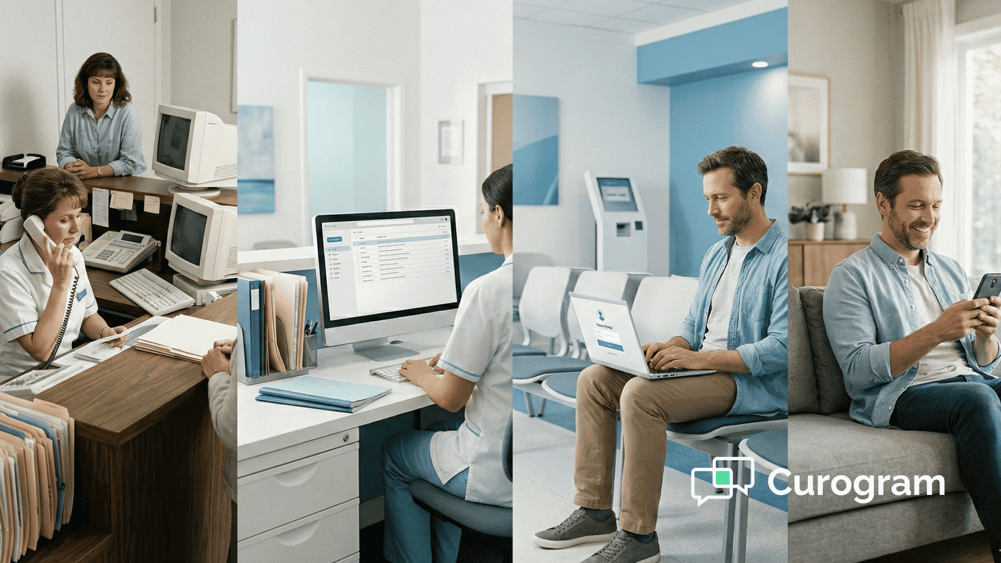
Patient Communication Evolution: Phone to Multi-Channel Guide (2026)
💡 Patient communication evolution refers to the shift from phone-only contact to multi-channel outreach in healthcare. For years, medical...

A patient leaves your office with a new care plan. She nods, smiles, and walks out the door. Two weeks later, she's back in the ER because she took her pills at the wrong time.
This story plays out every day across the country. The problem isn't that patients don't care. It's that the way we share medical information often fails them. When health literacy in patient communication breaks down, even the best treatment plan falls flat.
Think about the last set of discharge papers your practice handed out. Would a typical adult with no medical training be able to follow them word for word?
For many practices, the honest answer is no. The language is too dense, the font is too small, and the steps are buried under legal terms.
The cost of this gap is real. Patients who don't grasp their care plan are more likely to miss follow-ups, take the wrong dose, or skip meds entirely.
Based on our internal data, practices using clear, simple text-based reminders saw no-show rates drop from 14.20% to 4.91% in just three months. That shows how much clear medical communication matters.
This article walks you through practical, proven ways to make your patient-facing content easier to read, hear, and act on. You'll learn how to write at the right reading level, confirm what patients understood, use visuals that stick, and build a culture where everyone on your team puts clarity first.
Whether you run a solo clinic or a multi-site system, these steps will help you reach every patient, every time.
Low health literacy is one of the biggest hidden problems in U.S. healthcare. Roughly 90 million adults in America struggle to understand basic health information. That's more than one in three people, and many of them sit in your waiting room every day.
The impact touches every part of a practice. Patients with low literacy skills are more likely to visit the ER, get admitted to the hospital, and have longer stays.
They also tend to manage chronic conditions like diabetes and heart disease less well. Over time, this drives up costs for both the patient and the system.
Medication errors are one of the clearest signs of the problem. A patient who can't read a pill bottle label may take two tablets instead of one.
Another may stop a course of antibiotics early because the written directions confused them. These aren't careless mistakes. They're the direct result of poor medical information simplification.
There are also legal and ethical reasons to act. Federal rules like the Plain Writing Act push agencies to use clear language.
Many state laws require that consent forms and patient education materials meet certain reading levels. Failing to meet those standards could open your practice to risk.
The bottom line is simple: medical jargon must go. Terms like "contraindicated," "renal," and "bilateral" mean nothing to most patients.
Replacing them with everyday words is not about dumbing down your message. It's about meeting people where they are so they can take charge of their own health.
|
Impact Area |
Low Literacy Effect |
Clear Language Effect |
|
Med Errors |
Higher wrong-dose events |
Fewer mix-ups, safer dosing |
|
More missed visits |
Fewer gaps in care |
|
|
ER Visits |
3× more likely |
Reduced avoidable trips |
|
Treatment Sticking |
Poor follow-through |
Better self-management |
|
Patient Satisfaction |
Lower trust, more confusion |
Higher scores, stronger loyalty |
Plain language healthcare isn't about cutting corners. It's about choosing words that your patients already know. When you strip away jargon and keep things direct, patients hear you more clearly and follow through more often.
The fastest win is to swap medical terms for simple ones. Say "high blood sugar" instead of "hyperglycemia." Say "bleeding" instead of "hemorrhage."
If you must use a clinical term, for example on a lab result, define it right away in plain words. A good test: if your patient wouldn't use the word at the dinner table, find a different one.
Aim for an average of 15 words per sentence. Long sentences force readers to hold too many ideas in their head at once. Break each thought into its own line. Compare these two versions:
The second version says the same thing in half the words.
Active voice tells the reader who does what. "Take your pill at 8 a.m." is clear. "The pill should be taken at 8 a.m." leaves room for doubt. Active voice also feels more direct and personal, which builds patient understanding.
Put the most important point first. Patients who stop reading early will still get the key message. Use headers and numbered steps for anything that involves a sequence, such as wound care or prep before a procedure.
Sometimes a clinical word is required, like the name of a diagnosis or a test. When that happens, place the plain definition right next to it. For example: "You have hypertension (high blood pressure)." This way, patients learn the term and still understand it.
Writing in plain language is only half the battle. You also need to measure whether what you wrote actually hits the mark. That's where readability tools come in.
The Flesch-Kincaid formula is one of the most common ways to check reading level. It looks at two things: word length and sentence length. The output is a U.S. school grade level. For example, a score of 6.0 means a typical sixth grader could read and understand the text.
Most health literacy experts agree that patient materials should land between a 6th and 8th grade level. This doesn't mean your patients are not smart. It means people process health details better when the language is simple, especially when they're stressed or in pain.
You don't need to buy special software. Here are a few free options:
Numbers only tell part of the story. Ask a few patients to read your handout and tell you what it says. If they stumble or get a key point wrong, rewrite that section. Real feedback beats any formula.
Don't treat readability as a one-time task. Set a schedule, say once a quarter, to review your top patient-facing documents. Track the grade level each time. Over a few rounds, you'll see your content get clearer and your patients more engaged.

Even the clearest handout can't guarantee that a patient truly absorbed the message. That's why the teach-back method is one of the most trusted health literacy strategies in modern practice.
Teach-back is a simple check. After you share information, you ask the patient to explain it back in their own words. It's not a test of the patient.
It's a test of how well you communicated. If the patient can't repeat the key points, that tells you to try again with simpler language or a different approach.
Start with a warm, blame-free phrase. For example: "I want to make sure I did a good job explaining this. Can you walk me through what you'll do when you get home?" This keeps the focus on your explanation, not the patient's knowledge.
Use teach-back at each step, not just at the end. If a care plan has three parts, check after each one before moving on. This keeps the patient from feeling overwhelmed.
Here are a few lines your team can use right away:
Track teach-back results in your notes. A simple yes/no field in your EHR works fine. Over time, you can spot which topics cause the most confusion and update those materials first.
Record that teach-back was used and whether the patient showed understanding. This protects you legally and helps other staff who see the patient next. It also signals to the whole team that patient understanding is a priority, not an afterthought.

Words aren't always enough. Many patients learn better when they can see what you mean. Visual aids turn abstract ideas into concrete steps and help close the health literacy gap.
A labeled diagram of the body can help a patient locate where surgery will happen. A simple drawing of a pill bottle with arrows pointing to the dose and time can prevent mix-ups. Use real-life photos or clean line art. Avoid clip art that looks childish, which can feel insulting to adults.
When a topic has many steps or numbers, an infographic can organize everything on one page. For example, a chart showing blood pressure ranges, green for normal, yellow for elevated, red for high, gives the patient a quick visual reference to take home.
Short videos, two to three minutes, work well for tasks like wound care, inhaler use, or post-surgery stretches. Patients can watch them at home as many times as they need. Make sure any video uses plain speech and shows each step up close.
Icons like a clock for timing, a plate for "take with food," or a glass of water for "drink fluids" cross language barriers. Use the same set of symbols across all your materials so patients learn them quickly.
Use large print (at least 14-point font), strong contrast (dark text on a light background), and sans-serif fonts. For digital materials, add alt text to every image so screen readers can describe them. Making your visuals accessible is part of true medical information simplification for every patient, not just those with perfect eyesight.
Every piece of paper or digital message your practice sends is a chance to boost patient understanding, or to lose it. Here's how to make your written materials work harder.
Write instructions as numbered steps, not paragraphs. Start each step with an action verb: "Take," "Call," "Apply." Limit each step to one task. For example, instead of "Take your pill twice daily with a full glass of water and avoid grapefruit," split it into two steps.
Consent forms are often the worst offenders for hard language. Rewrite them at an 8th grade level or lower.
Use short sentences, clear definitions, and a question-and-answer format where you can. Ask your legal team to review the simplified version. In most cases, a clearer form still meets legal standards.
These summaries are the patient's "take-home guide." Include only the most important points: diagnosis in plain words, next steps, and who to call with questions. Bold the action items so they stand out at a glance.
Based on our internal data, practices that paired clear follow-up messages with automated text reminders saw a 35% appointment reconversion rate from patients who had fallen off the schedule.
Use a table format for multi-drug regimens. Columns might include: drug name, what it's for, dose, time, and special notes. This makes it easy for a patient, or a family helper, to follow along without mixing things up.
|
Medicine |
What It's For |
Dose |
When to Take |
Notes |
|
Metformin |
Blood sugar |
500 mg |
Morning and night |
Take with food |
|
Lisinopril |
Blood pressure |
10 mg |
Morning |
Drink water |
Use white space to your advantage. Crowded pages overwhelm readers. Stick to one or two fonts, use bullets only for lists, and keep the page to one side when possible. A clean layout signals that the content is simple and worth reading.
.png?width=1333&height=2000&name=Health%20Literacy%20Making%20Medical%20Communication%20Understandable-mid%20(1).png)
Not every message goes on paper. Much of health literacy patient communication happens face to face or over the phone. How you speak matters just as much as what you write.
Slow down. Most providers talk too fast, especially when they're behind schedule. Aim for a calm, steady pace. Pause after each key point to let it sink in. If you're on the phone, the pace should be even slower because the patient can't read your body language.
Don't deliver a 10-minute lecture all at once. Break it into chunks of two or three points, then pause. For example: "First, let's talk about your new medicine. Then we'll cover your diet changes. Last, we'll set your next visit." This gives the patient a mental map of the conversation.
Analogies make the unfamiliar feel familiar. Explaining blood pressure? Try: "Think of your blood vessels like a garden hose. When the pressure is too high, the hose wears out faster." This kind of comparison sticks with people far longer than a clinical number on a chart.
Don't wait until the end to ask, "Do you have any questions?" Most patients will say no even if they're confused. Instead, check in after each chunk: "Does that make sense so far?" or "What questions do you have about that part?" These open-ended checks invite honest responses.
Create a safe space for asking. Say things like, "There are no silly questions here," or "Many of my patients ask about this, so don't worry." When patients feel safe, they speak up. And when they speak up, you catch gaps in clear medical communication before they become problems.
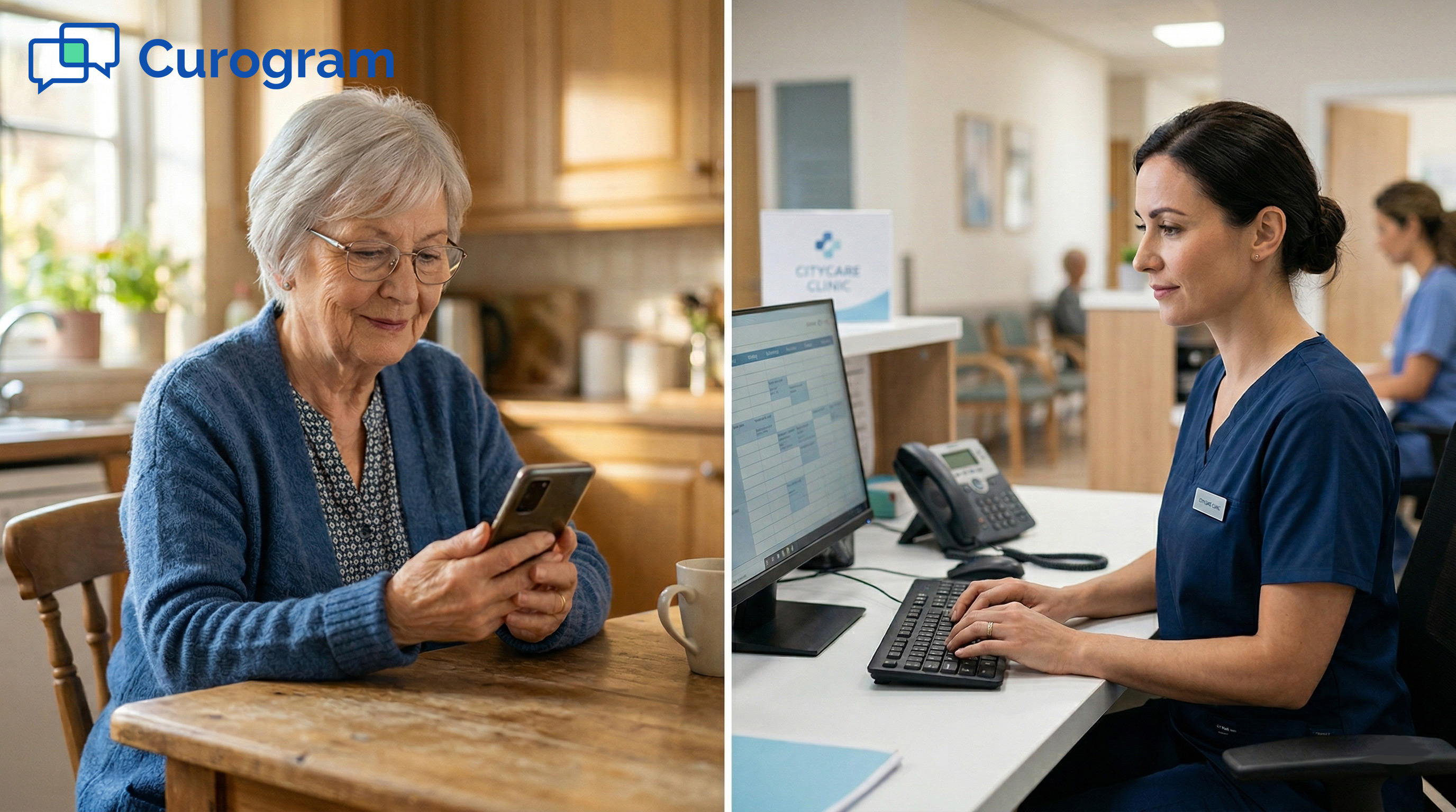
Today, a large share of patient communication happens on screens. If your digital tools are confusing, even the best in-office conversation can be undone the moment a patient goes home and opens their phone.
Keep your portal simple. Use clear menu labels like "My Visits," "My Messages," and "My Test Results" instead of internal system names. Reduce the number of clicks it takes to find key info. If a patient needs five clicks to view lab results, most will give up.
If your practice is evaluating how a new communication tool connects with your existing EMR, our guide to integrating Curogram with your systems walks through the full setup process.
If your practice uses a mobile app, make sure it follows the same plain language rules as your print materials. Use large buttons, simple icons, and short text. Test the app with real patients of different ages and comfort levels with technology.
Text messages are limited by space, which can actually help. Keep each message to one idea. For example: "Your visit is on March 15 at 2 PM. Reply YES to confirm."
Skip abbreviations that could confuse older patients. Based on our internal research, practices that use clear, concise texting see over 75% average appointment confirmation rates.
Virtual visits are now a fixture in healthcare. But many patients still struggle to log on. Send step-by-step directions with screenshots at least 24 hours before the visit. Include a phone number to call if the link doesn't work. Clear prep instructions lower no-show rates and reduce staff time spent on tech support.
Digital tools only work when patients can actually use them. Every screen, button, and message is a chance to either build trust or create frustration. Designing for clarity at every digital touchpoint is one of the most important health literacy strategies a modern practice can invest in.
Making your content clear is a great first step. But real change happens when the whole practice commits to a health literacy culture, from the front desk to the exam room.
Staff Training Requirements - Every team member who speaks to patients should receive training on plain language, teach-back, and the basics of health literacy. This includes front desk staff, nurses, medical assistants, and billing teams.
Universal Precautions Approach - In infection control, you treat every patient as if they could be at risk. The same idea applies here. Assume every patient may struggle with health content, and use plain language with everyone.
Quality Improvement Monitoring - Add health literacy checks to your quality reviews. Track the reading level of your top 10 patient handouts. Monitor teach-back usage rates. Review patient portal login and message-open rates.
Patient Feedback Integration - Ask patients directly. Add a simple question to your post-visit survey: "Were the instructions you received easy to understand?" Use that feedback to update your materials. Patients are the best judges of whether your content is clear.
Resources and Support - Organizations like the CDC, the Agency for Healthcare Research and Quality, and the American Medical Association publish free plain language toolkits. Use these to train staff and audit your materials. You don't need to build everything from scratch.
When clarity becomes part of your practice's identity, it touches every interaction. Patients feel more confident, staff spend less time repeating themselves, and outcomes improve across the board. That's the power of putting patient understanding at the center of everything you do.
Health literacy is not a nice-to-have. It's the foundation of safe, effective care. When patients can't understand their instructions, even the best treatment plan fails. The good news is that fixing this doesn't take a massive budget or a new system. It starts with simple choices made every day.
You now have a clear playbook. Write at a 6th–8th grade level. Use short words and short sentences. Swap jargon for everyday language.
Check your work with readability tools. Confirm what patients heard by using teach-back. Add visuals that make key points stick. And bring the same level of clarity to your digital tools, from your patient portal to your text messages.
The results are worth the effort. Practices that commit to clear, consistent communication see fewer no-shows, fewer ER visits, and stronger patient loyalty.
Based on our internal data, one practice cut its no-show rate by more than 65% in three months simply by sending clear, well-timed reminders. Imagine what your practice could do by applying that same thinking to every patient touchpoint.
Building a true health literacy culture means going beyond documents. It means training your entire team, asking for patient feedback, and treating clarity as a core part of quality care. It means never assuming that a nod in the exam room equals real understanding.
Start small. Pick one handout, one form, or one template this week and rewrite it in plain language. Test it with a patient. Measure the result. Then do it again. Over time, these small wins add up to a practice where every patient walks out the door knowing exactly what to do next.
If your patients struggle with complicated portals, they're not the problem — the tool is. Schedule a Curogram demo to see you can handle everything in plain, patient-friendly language.
💡 Patient communication evolution refers to the shift from phone-only contact to multi-channel outreach in healthcare. For years, medical...
💡 Texting elderly patients is practical when you use the right approach. Most adults over 65 now own smartphones, so the real challenge is not...
Technology is one of the greatest allies of efficiency in the healthcare industry. It has reduced the number of daily manual processes, from patient...