
.jpg) Mira Gwehn Revilla
Mira Gwehn Revilla
Healthcare Staffing Optimization: Peak Hours Analytics Guide
💡 Healthcare staffing optimization peak hours analytics reveals what raw headcount counts can't. Most staffing problems are not about hiring...

It's Tuesday at 10 a.m., and the front desk looks calm. But three patients just hung up after waiting 15 minutes. Two appointment reminders went unanswered. Nobody at the desk knows yet.
By Friday, your no-show rate will tick up. By next month, two patients will leave one-star reviews. By the quarter's end, revenue will dip without a clear reason. This kind of silent breakdown happens in busy practices every week.
The problem isn't the staff. The problem is the missing data. Most administrators fly blind because no one has built them a real dashboard. They rely on hallway chatter and gut feel instead.
That's where the right practice administrator KPIs metrics team efficiency healthcare framework changes everything. Good numbers turn guesswork into clear action steps. They show you what's broken before patients feel the impact. And they help you fix issues fast.
In this guide, you'll learn the five most important numbers to track. Each one tells you something different about how your team is running. Together, they form one live picture of daily operations.
You'll see which metric to watch first and why. You'll learn how each one shapes the next. You'll also get real benchmarks drawn from practices already using this approach.
These aren't vague, feel-good numbers. They are hard signals that drive better choices each week. Whether you run one office or a 50-location group, the same five metrics apply.
The goal isn't more data. The goal is the right data, shown the right way, at the right time. Read on to see how a five-metric dashboard can transform how you lead your team.
Practice administrators make dozens of choices each day. Is the front desk understaffed? Are patients getting fast replies? Are reminders working? Most answer these by feel, not by fact.
Common sources of input include staff complaints, patient feedback, and a personal sense of how busy the lobby looks. These signals are real, but they are also late and partial.
A manager who feels slammed may just be hitting a short peak while overall work is low. A clinic with few complaints may have rising no-shows that have not yet shown up as feedback.
That's why qualitative feel alone is not enough. It tells you something is off but never what or why. By the time the issue is loud enough to notice, the damage is often done. You end up reacting instead of leading.
Five core metrics close this gap. Each one reveals a different slice of daily health, and together they form one full view. Watching all five on one screen turns the job from intuition-based to data-based. The administrator sees the whole system live and can act with care and speed.
This is what proper team efficiency measurement medical leaders use looks like. It's less about more data and more about the right signals. The five numbers below were picked because they tie directly to revenue, patient trust, and staff workload.
Here's a quick look at what you'll be tracking:
|
Metric |
What It Shows |
Type |
|
Average Response Time |
Speed of staff replies |
Leading |
|
Inbound Message Volume |
Demand on the team |
Context |
|
Peak Hour Staffing Alignment |
Match of staff to demand |
Operational |
|
Appointment Confirmation Rate |
Patient follow-through |
Leading |
|
Patient Satisfaction Score |
Final outcome |
Lagging |
Each row will be unpacked in the sections that follow.
Average Response Time is the middle time between a patient's message and your staff's reply. It's tracked all day and broken down by hour and weekday. For most primary care and urgent care practices, a healthy goal sits between 15 and 20 minutes.
When this number climbs, two root causes are likely:
Headcount issue: too few staff for the total inflow
Alignment issue: enough staff, but at the wrong hours
Both look the same on the surface, but they need very different fixes.
This is the most powerful of the front desk KPIs healthcare leaders track. Why? Because it sits upstream of almost every other outcome. When replies get slow, confirmation rates drop within days. When confirmation rates drop, no-shows rise a week or two later. When no-shows rise, revenue falls.
|
Here's a quick example: Say your clinic gets 100 messages a day with a 12-minute average reply. Patients confirm quickly, and your no-show rate sits near 5%. Now imagine reply time slips to 45 minutes during summer vacation coverage. Within two weeks, your confirmation rate may fall by 10 to 15 points. No-shows climb soon after. |
The fix begins with watching the metric daily. If you see a 30-minute reply window two days in a row, that's a red flag. You can shift breaks, move staff to busy hours, or batch low-value tasks.
Based on our internal data, practices that adopt two-way SMS see phone call volume drop by as much as 50%. That alone gives staff back hours each day to reply faster. Faster replies then unlock all the wins below.
Track this metric first. It's the highest-leverage lever you have.
Inbound Message Volume is the raw count of patient messages your team gets each hour and day. Unlike response time, there is no universal "good" number here. Volume depends on practice size, specialty, and how many active patients you serve.
But volume gives vital context for the other numbers. A 20-minute reply time with 20 daily messages is great. The same reply time with 200 daily messages means your team is near capacity. Without volume data, you can't tell the difference.
Volume also tells you when to grow your team and when to fix your workflow. A small spike on Mondays may just call for shifted breaks. A steady climb over six months likely means it's time to hire or automate.
Here's where volume gets even more useful: break it down by message type. Many practices find that a large slice of inbound messages are simple confirmations or routine questions. These can be automated, freeing staff for clinical needs.
For example, imagine your team handles 4,000 messages a month. After tagging them, you find:
|
Message Type |
% of Total |
Automatable? |
|
Appointment confirmations |
30% |
Yes |
|
Reschedule requests |
18% |
Mostly |
|
Billing questions |
12% |
Partly |
|
Clinical questions |
25% |
No |
|
Other admin |
15% |
Partly |
That's a clear sign: nearly half of inbound volume could be handled without manual staff time. You don't need more people. You need smarter systems.
This is why volume is a key piece of medical practice staff performance metrics. It tells you if your team needs more hands or better tools.
Based on our internal research, Curogram clients see staff productivity rise by 30% or more once routine messages are automated. That gain comes from cutting volume, not adding effort.
Peak Hour Staffing Alignment compares your staff levels to your message and call volume during your busiest hours. It's the ratio that drives whether response time stays healthy or slips. A healthy goal is 90% or higher: peak staff is present when peak demand hits.
Low alignment, often in the 60% to 70% range, points to two issues. Either you don't have enough total staff, or your schedule doesn't match real demand. The second is more common and easier to fix.
|
Here's a simple way to see it: Imagine your clinic gets the most inbound calls and messages between 9 and 11 a.m. on Mondays. But your full team only starts at 10 a.m. that day. By the time everyone is on, you're already an hour behind, and reply times will suffer all morning. |
To improve alignment, pull a heat map of message volume by hour. Then compare it to your staff schedule. The gaps tell you exactly when to shift breaks, lunches, or arrival times.
Many practices find a 15% improvement in reply times just from this one fix. No new hires needed. That's why this metric is core to any practice administrator dashboard metrics setup. It turns staffing from guess to plan.

Appointment Confirmation Rate is the share of appointment reminders that get a confirming reply from the patient. It is a strong leading sign of who will actually show up. Higher confirmation rates almost always lead to lower no-show rates.
Based on our internal data, Curogram clients see confirmation rates above 75%. That's driven by two-way SMS and direct EHR integration that lets patients confirm in one tap. Industry averages tend to sit much lower, often below 50% without modern tools.
Why does this matter? Because the gap between a confirmed and unconfirmed slot is huge. Confirmed slots no-show at very low rates. Unconfirmed slots have a much higher chance of going empty.
Watch this number weekly. If it drops by 5 to 10 points, expect no-shows to spike within two weeks. That's your window to act. Send extra reminders, call high-risk patients, or fill at-risk slots from your waitlist.
Atlas Medical Center, based on our internal research, used this kind of approach to cut its no-show rate from 14.20% to 4.91% in just three months. That's nearly three times better than the average clinic.
Patient Satisfaction Score is the outcome metric in the group. It's broken down by location and provider, so you can spot patterns. It's a lagging signal, meaning it shifts after the other four have already moved.
Track this through short, automated post-visit surveys. Aim for a steady rise tied to the other operational wins. If reply times improve and confirmation rates climb, satisfaction should follow in 4 to 8 weeks.
This metric also drives reviews. Based on our internal data, one multi-location practice saw 90% of patients leave 5-star reviews after launching post-visit surveys, bringing in 1,064 new 5-star reviews in just three months. That's the lift that turns happy patients into new patient growth.

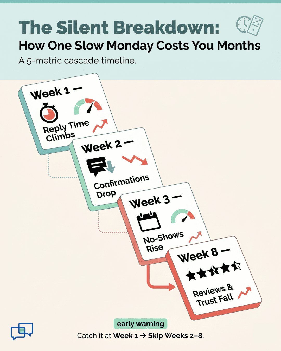
The real power of these five metrics isn't in any single one. It's how they connect. Response time rising today often means confirmation rates falling next week. Falling confirmation rates mean rising no-shows two weeks after that.
That's why one dashboard beats five spreadsheets every time. When you see all five live on one screen, you can spot a slip before it cascades. The dashboard becomes an early warning system, not a rearview mirror.
Here's how the cycle looks in action:
|
Week |
What Slips |
What Happens Next |
|
Week 1 |
Response time climbs to 45 min |
Patients grow frustrated |
|
Week 2 |
Confirmation rate drops 8 points |
No-show risk builds |
|
Week 3 |
No-shows rise 3-4 points |
Revenue starts to dip |
|
Week 4-8 |
Satisfaction score falls |
Reviews and referrals weaken |
Now flip the script. Catch the response time slip in week one, and the rest never happens. That's the power of leading indicators tracked in real time.
This dashboard approach also scales. Group administrators can view all five metrics across every location at once.
They can then drill down to one location, one provider, or one hour to find the source of any issue. A Master Dashboard makes it possible to manage even a 100-plus location group with clear visibility into every operational layer.
Based on our internal data, practices using this kind of live dashboard see no-show rates fall 53% below industry averages. That alone can drive a 10% to 20% revenue lift, since each recovered appointment goes straight to the bottom line.
Strong healthcare operations KPIs aren't about more reports. They're about fewer, sharper signals that tell you what to do next. The five-metric dashboard turns weekly chaos into clear weekly action. That's what makes the difference between a practice that reacts and one that leads.
Running a busy practice without the right metrics is like driving in heavy fog. You can keep moving, but you'll miss every turn. The five KPIs in this guide turn the fog into a clear road.
Each metric does a job. Response Time tells you how fast your team is moving. Volume tells you how heavy the demand is. Staffing Alignment shows if your team is in the right place at the right time.
Confirmation Rate predicts who will show up next week. Satisfaction Score confirms that all your work is paying off in patient trust. None of these can stand alone, but together they form a full picture.
The key shift is moving from gut feel to live data. You stop reacting to last month's problems and start fixing this week's risks. You stop hearing about issues from staff and start spotting them on a screen.
This is what good team efficiency measurement medical leaders use looks like in real life. It's not fancy. It's just five well-chosen numbers, tracked daily, displayed clearly.
Start small. Pick Response Time and watch it for two weeks. Add Volume next, then layer in the rest. Within a quarter, you'll have a full dashboard and a sharper team.
The best part? These metrics tend to lift each other. Improve one, and the rest follow. Automate confirmations, and reply times drop. Drop reply times, and satisfaction climbs. The cycle works in your favor.
Catch slipping KPIs before they cost you. Schedule a Curogram demo and see how a live dashboard flags issues weeks before they hurt revenue.

💡 Healthcare staffing optimization peak hours analytics reveals what raw headcount counts can't. Most staffing problems are not about hiring...

💡 Running a health system with 172 locations means data lives in 172 places. Most tools give you site-level reports, not a single group view. A...

💡 Medical staff performance analytics for a practice reveal hidden gaps that gut feel cannot catch. Most front desks are not understaffed. They...