
 Jo Galvez

Curogram produces these numbers as a byproduct of running your texting, reminders, and campaigns.
- Confirmation rate, median response time, no-show trend, and review growth for every location
- One group rollup, with filters by location and date range
- Metrics tied to appointment outcomes on the schedule
- A weekly one-page ranking an owner can read in five minutes
Your marketing report and your billing report both land on Monday. One says new-patient demand is up. The other says collections haven't moved.
Somewhere between those two numbers, patients were lost. They booked and didn't confirm, or called and waited too long, or got a reminder they couldn't answer. Neither report can say which location it happened at.
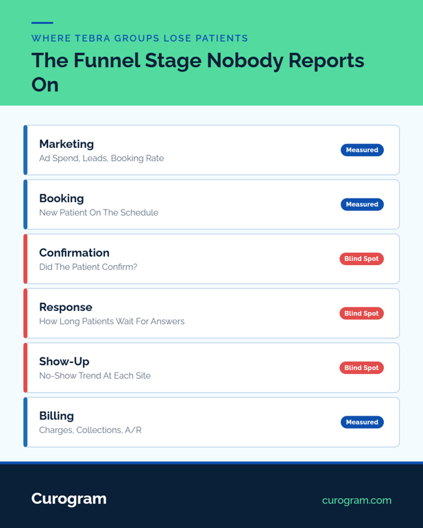
Growing Tebra groups tend to run the top and bottom of the funnel on real data. Ad spend, cost per lead, and booking rate get tracked weekly. Charges, collections, and days in A/R get tracked monthly.
The middle runs on a question in the ops meeting: "How are things over at Birch?"
That middle stage is where a booked patient turns into an empty slot, and it deserves the same scoreboard as the stages around it. Once each location's engagement numbers sit side by side, the gap between demand and revenue gets an address.
The Villain: The Network Blind Spot
Owners of multi-site groups get plenty of reports. The one that covers patient communication is usually missing.
What the Dashboards Show, and What Sits Between Them
Marketing tools count demand. Tebra's billing side counts revenue. Neither one counts what happened on the phones, in the text inbox, and in the reminder queue at each site.
So the ops meeting fills that gap with stories. Birch "seems slammed." Cedar "is doing fine." Nobody can check.
How a Leak Hides in Plain Sight
Illustrative example: marketing reports new-patient demand up 20% for the quarter, and revenue stays flat.
One possible cause is a site's front desk taking four hours to answer texts. It could be a reminder setting that skips a new provider.
It could be a campaign whose replies nobody claimed. Each one lives in a different system, at a different location, and no report ties them together.
Why Good Habits Don't Spread
Every group has a site that runs better than the rest. Without comparable numbers, nobody can prove which one it is.
Your best front desk lead's habits stay in her building. Marketing spends more to cover leaks nobody has located. The MGMA's August 2024 poll found 37% of medical groups saw no-show rates rise.
Many of those groups used the same reminder tools as groups that improved. Knowing which of your sites sits in that 37% takes per-location data.
The Guide: The Network Scoreboard
Curogram works alongside Tebra through our Tebra integration. Because it already runs the group's texting, reminders, and campaigns, the metrics come from work that's happening anyway.
What Gets Measured at Every Site
The per-location analytics growing group owners actually use fit on one screen:
|
Metric |
What It Tells You |
|---|---|
|
Confirmation rate |
Whether reminders are landing |
|
Median response time |
How long patients wait for an answer |
|
No-show trend by location |
Whether a site is improving or slipping |
|
Review growth |
Whether patients are happy enough to say so |
Each one filters by location and period, and rolls up to a group view.
Funnel Middle Measurement, Tied to the Schedule
These numbers connect to appointment outcomes on the schedule. A confirmation links to a kept visit, and an unanswered thread links to a slot that went empty.
That's what makes funnel middle measurement useful. The marketing figure and the billing figure finally have a bridge, site by site. Our practice analytics dashboards show the master view and the per-clinic views.
The Five-Minute Weekly Review
A worked example, with illustrative figures:
1. Rank. Sort sites by confirmation rate. Cedar sits at 81%, Birch at 62%.
2. Investigate. Open Birch. Median response time jumped from 40 minutes to 3 hours after a front desk hire left.
3. Coach. The regional manager moves Birch's overflow texts to Cedar's team for two weeks.
4. Verify. Next Monday, Birch's response time is back under an hour, and its no-show trend by location has stopped rising.
To benchmark locations, confirmation rate is the first number to rank. It moves fastest when something breaks.
Curogram Highlight: Per-Location Dashboards
Per-Location Dashboards give an owner one comparable view of every site, plus a group rollup. Confirmation rate, response time, no-show trend, and review growth all sit on the same page, filterable by location and date range.
Nothing needs to be built. Every number comes from reminders sent, replies received, and threads answered inside Curogram.
Each weekly summary reads like a Tebra communication performance report for each site. It adds one page to the owner dashboard: patient engagement by location, ranked.

The Success: Managed Because Measured
Based on our internal data, Curogram clients hold confirmation rates above 75%. The weekly scoreboard is how a group keeps every site near that line.
From the Anecdote Meeting to the Scoreboard Review
Monday's meeting changes shape. It opens with a ranked list of sites.
A site that drops shows up in the next weekly cycle, weeks before the quarterly review. From there, the conversation moves straight to cause: a staffing gap, a settings change, a campaign surge.
What the Demand-to-Revenue Gap Looks Like Now
The 20% demand bump from earlier gets an explanation. Two sites turned it into kept visits. One site let it pile up in an unanswered inbox.
That's a specific, fixable problem with a location attached. For how to judge that site's front desk fairly, see our guide to benchmarking front desk performance across Tebra locations.
How the Best Site's Playbook Spreads
Once Cedar's numbers prove it leads, its habits become the standard. Other sites copy its reply scripts and staffing times.
The same scoreboard tracks the campaigns that feed it, from standardizing appointment reminders across Tebra locations to network recall and reactivation.
Patients feel the difference too, which our piece on measuring patient response experience across Tebra locations covers.
Conclusion: Light Up the Middle of the Funnel
A group this careful with marketing and billing numbers shouldn't run its middle stage on hunches.
Tebra holds your demand and revenue records. Curogram measures patient engagement between them, one location at a time.
Try this test on Monday. Ask for last week's confirmation rate by location. If the answer takes more than a minute, you've found the blind spot.
Book a demo, and we'll set up the scoreboard against your real location list and show the first ranking live.
Frequently Asked Questions