
 Jo Galvez

Curogram counts it automatically as texts, reminder replies, and recall responses move through the shared inbox, with no time studies and no self-reporting.
Messages handled per staffer at each location. Median first-response time by site and queue. Resolution rate, so fast replies that don't solve anything don't score well. Hour-by-hour volume curves that show campaign surges
Owners get staffing and coaching decisions backed by workload data. The team carrying the most finally shows up in the numbers.
Owners tend to judge front desks by how busy they sound. The site that calls the regional manager every afternoon gets the extra hire. The site that never calls gets asked why its phones go to voicemail.
That's a poor way to make people decisions, and most multi-site groups make them this way because they have nothing better to go on. Phone systems count rings.
Nobody counts the total patient-communication load at each location, including the inquiry spikes that marketing campaigns send to some sites more than others.
A fair benchmark needs two numbers side by side: how much work each team carries, and how fast it gets done. With both, coaching goes where the data points, and hiring follows the actual workload.
The Villain: The Unfair Comparison
Front office work is measurable in theory. In most groups, it's measured nowhere.
Two Sites, Same Headcount
Illustrative figures for one week:
|
Metric |
Cedar |
Birch |
|---|---|---|
|
Front desk staff |
3 |
3 |
|
Patient threads handled |
410 |
820 |
|
Of those, campaign replies |
20 |
190 |
|
Threads per staffer |
137 |
273 |
|
Median first response |
22 min |
35 min |
Birch looks slower. It's also handling twice the message volume per location, including 190 replies from a recall campaign aimed at its zip codes.
What the Owner Actually Hears
Without that table, the owner hears two things. Birch's afternoons are "slow to respond." Cedar "runs smooth."
So Birch's lead gets a talking-to about response times. Cedar gets praised. Nobody mentions the 190 campaign replies that landed on Birch's inbox that week, because nobody counted them.
Where Turnover Starts
Front office turnover drivers show up in what practice leaders say works against them. In a May 2025 MGMA Stat poll, practice leaders ranked engagement, including recognition and a voice in decisions, as a top front-desk retention tactic, tied with higher pay at 33%.
A team that carries double the load and gets criticized for it isn't being recognized. The problem hasn't gone away either: MGMA's May 2026 poll found 28% of practices saw turnover rise, with front-desk and patient access roles still a major churn point.
The Guide: The Network Scoreboard
Curogram counts every location's real communication workload and how fast it's handled. It works alongside Tebra through our Tebra integration, so the schedule stays in Tebra while the conversations run through one shared platform.
What Gets Counted
Texting, reminder replies, and recall responses all flow through the same inbox. That makes the workload picture complete, campaign surges included.
For each site and queue, the views show messages handled, median first-response time, resolution rate, and volume by hour. A front desk response time metric means little without the volume next to it, so the two always sit together.
How to Read the Numbers Fairly
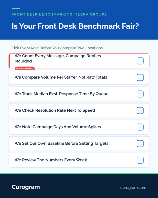
1. Start with volume per staffer. Raw totals favor big sites. Per-person numbers show who carries what.
2. Check the volume curve. A spike at 10 a.m. Tuesday usually traces back to a campaign send.
3. Then read response time. A 35-minute median at 273 threads per person tells a different story than 35 minutes at 137.
4. Last, check resolution rate. A fast reply that needs three follow-ups isn't a win.
That order is a fair workload comparison: locations ranked by what each person handles, then by speed.
Coaching With Data, Not Impressions
The views are built for coaching. They show team-level trends with context, such as campaign days and volume spikes, so a slow week has an explanation attached.
That gives managers staff coaching data group leaders can trust. The conversation with Birch's lead starts with "You handled 820 threads" instead of "Your afternoons are slow."
Curogram Highlight: Team Performance Views
Team Performance Views show every location's messages handled, median first-response time, resolution rate, and hourly volume, per site and per queue. Owners see the group; managers see their own teams.
The numbers generate from the shared inbox as work happens. There's nothing for staff to log, and nothing for managers to compile at month end.
Our response time analytics also flag peak-volume periods, so staffing can match the hours that actually run hot.

The Success: Coaching Where the Data Points
Group median first-response time becomes a number someone manages. Based on our internal data, Curogram clients confirm more than 75% of appointments, and that follow-through becomes every location's baseline.
From "Who Seems Busy" to "Who Carries What"
Staffing decisions start with volume per staffer. In the illustrative week above, Birch's case for help is obvious on paper before anyone raises it in a meeting.
Coaching changes too. Cedar's team gets asked what it does to keep resolution rates high. Birch gets relief first and coaching second.
What Changes for the Team That Was Drowning
Birch's lead gets a part-time hire, or overflow texts route to Cedar during campaign weeks. Her response times drop because her load dropped.
And the praise shifts. The team that handled 820 threads gets credit for it in the Monday review.
Where Performance Talks Start Now
Every performance conversation now opens from the same facts. For the group-wide view these numbers roll up into, see our guide to location-level patient engagement reporting for Tebra groups.
The shared inbox that produces the data is covered in our multi-location command center overview.
Conclusion: Be Fair By Being Informed
Front desk teams should be judged on measured work. Right now, most are judged on who complained last.
Tebra runs your schedule and billing. Curogram shows the communication workload that surrounds them, site by site.
Before your next staffing decision, pull one week of real per-location volume data. It may reverse the decision.
Book a demo, and we'll show what two weeks of benchmark data reveals about a group like yours.
Frequently Asked Questions