7 min read
Per-Office Engagement Analytics for Practice Fusion
Aubreigh Lee Daculug
:
August 21, 2026
Curogram produces these numbers as a byproduct of the texting, reminders, and campaigns each office already runs. The owner sees the group rollup. Each manager sees their own site.
Groups that manage against a shared scoreboard hold confirmation rates above 75% and catch a drifting office in weeks instead of quarters.
Ask five office managers how last week went. You will get five confident answers.
You will not get a single number you can compare.
One says the phones were brutal. One says the new front desk hire is "finally clicking." One says no-shows are about the same as always. Every answer sounds reasonable. Not one of them can be checked.
That is the hard part of running a multi-office group. Your clinical data is clean. Your billing data is clean. But your engagement data does not exist at all.
So you drive. You visit Oak on Tuesday, Elm on Thursday, and you form an opinion based on the twenty minutes you spent in each lobby.
That opinion becomes strategy. Sometimes it is right. Often it is just the loudest impression from the most recent visit.
Meanwhile, one of your offices is quietly underperforming. Its confirmation rate slipped last quarter. Its average reply to a patient text is nine hours instead of forty minutes. Its no-show rate has climbed four points.
None of that shows up in a report. So nobody flags it, and nothing changes.
Here is the uncomfortable part. The office you worry about most is usually fine. The one you almost never think about is the one quietly leaking money.
Practice Fusion was built to document care and get claims out the door. It does that well. It was never built to score how your locations communicate with patients between visits, which is exactly where confirmations, recalls, reviews, and no-shows are won or lost.
You cannot coach what you cannot compare. And right now, you cannot compare.
This article shows what a real engagement scoreboard looks like across a group, which five numbers matter, and how owners use one weekly page to replace a month of windshield time.
Five Offices, Five Stories, One Missing Number
Your EHR answers questions about what happened during the visit. It goes quiet on everything that happens around it.
That gap has a name: the network blind spot. It is the reason a Practice Fusion communication performance report is not something you can pull on a Monday morning, no matter how many tabs you open.
| Question you ask | Where the answer lives |
|---|---|
| How many visits did Elm bill last month? | Practice Fusion |
| Which office confirmed the most appointments? | Nowhere |
| How fast does each front desk answer a patient text? | Nowhere |
| Whose no-show rate is climbing? | Nowhere |
| Which office earned the most new reviews? | Nowhere |
Four of five rows are blank. That is not a reporting gap. That is management by anecdote.
The cost of not knowing
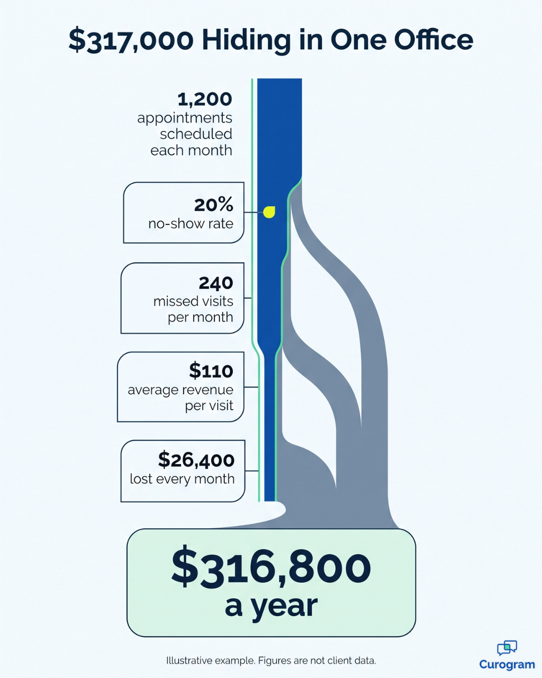
Underperformance survives where it is invisible. An office can run a 20% no-show rate for a full year before anyone puts a dollar figure on it.
Here is what that looks like in plain math. This is an illustrative example, not client data.
| Illustrative figure | Amount |
|---|---|
| Appointments scheduled per month | 1,200 |
| No-show rate | 20% |
| Missed visits per month | 240 |
| Average revenue per visit | $110 |
| Monthly revenue lost | $26,400 |
| Annual revenue lost | $316,800 |
This means one office, one blind spot, and roughly $317,000 gone in twelve months. Not stolen. Just never measured.
And the damage is not only financial. When you cannot see which location performs best, you cannot copy it. Your strongest office has a routine that works, and it stays locked inside that building because nobody can prove it works.
The Scoreboard Your EHR Was Never Built to Produce
The fix is not another data project. You do not need a warehouse, an analyst, or six months of setup.
You need the communication layer you are already running to keep score while it works.
Measurement that happens on its own
Every reminder counts. So does every answered text, every recall campaign, and every review request. Curogram logs each one as it happens.
What you get is per-office analytics medical group owners can act on right away. Nothing to build. Nobody to hire. The score keeps itself while your team just does the work.

The five numbers on the page
- Confirmation rate: the share of appointments patients actively confirm.
- Median response time: how long a patient waits for a human reply.
- No-show trend by office: the direction over weeks, not a single snapshot.
- Review velocity: how many new reviews each site earns per month.
- Campaign conversion: recall texts that turned into booked visits.
You can filter each number by office and by date range. Together they form the multi-office practice KPI set that shows how your network treats patients between visits.
Tied to the appointments you already watch
These metrics connect back to Practice Fusion appointment outcomes.
So a confirmation rate is not a vanity number in a marketing tool. It sits next to the visit that did or did not happen. And next to the money attached to it.
One view for the owner, one for each manager
Role-based access scopes each office manager to their own location. You see the group rollup. Everyone works from the same definitions at their own level, which ends the debate about whose spreadsheet is right.
The owner dashboard patient engagement data flows into is built for a five-minute read: rank, investigate, coach, verify. You can do it from anywhere, which is a meaningful change if your current instrument is a car.
What Changes When Engagement Becomes a Managed Number
The shift is smaller than it sounds and bigger than it looks. Meetings stop starting with opinions and start with a ranking.
Groups that run this way hold confirmation rates above 75%. They also spot a drifting office within two weekly cycles instead of two quarters.
Curogram clients see the staffing side of it too. One verified figure:
A 30%+ gain in front desk productivity once messaging and reporting sit in one place.
Here is the before and after.
| The anecdote meeting | The scoreboard review |
|---|---|
| "Oak feels understaffed." | Oak's median response time is 4 hours; Elm's is 45 minutes. |
| "No-shows are creeping up, I think." | Maple's no-show rate moved from 11% to 15% over six weeks. |
| Problems surface after a bad quarter. | Problems surface after two bad weeks. |
| Best practices stay local. | The top office's routine gets documented and taught. |
For your team, that changes the conversation from defending a feeling to fixing a number.
It also makes fairness possible. When you benchmark offices by confirmation rate, you can adjust for panel size, specialty mix, and visit volume.
A busy urban site is not punished for being busy. Fair comparison is what makes a ranking useful instead of resented.
And variance narrows from the top. Once your best office is identifiable, its playbook becomes teachable, and the gap between your strongest and weakest location starts closing on purpose rather than by luck.
Your First Four Weeks on the Scoreboard
Most groups expect a rollout to take a quarter. It takes about a month, and the first three weeks are mostly watching.
Here is a sequence that works.
- Week one — set the baseline. Turn on reporting and let a full week of normal activity run. No coaching yet. You are only finding out where each office actually starts.
- Week two — publish the ranking. Share confirmation rate by office with every manager. Say nothing else. Visibility alone tends to move the bottom two sites.
- Week three — coach the lowest number. Pick one office and one metric. Ask the top performer what they do differently, then copy that routine exactly.
- Week four — verify. Check whether the number moved. If it did, document the routine. If it did not, the problem is staffing or process, not effort.
That last distinction saves a lot of wasted energy. A manager who is trying hard and still missing the target needs help, not pressure, and the data tells you which one you are looking at.
Small gains add up fast here. Lifting one office from a 65% confirmation rate to 78% on 1,200 monthly appointments means roughly 156 more confirmed visits a month. At $110 a visit, that is about $17,000 in monthly revenue you were already scheduled to earn.
This is an illustrative example, not client data.
For your team, the point is not the dashboard. It is that Monday now starts with a ranked list instead of five opinions.
Ask One Question This Week
Try this small test before you change anything. Ask for last week's confirmation rate by office.
Time the answer.
If it takes more than a minute, you have found your blind spot. Not a small one. Confirmation behavior drives no-shows, no-shows drive revenue, and revenue is the thing you check every month without ever seeing what causes it.
That combination is unusual, and it works in your favor. Engagement performance is decisive to your bottom line and almost entirely unmeasured in most groups. Anything decisive and unmeasured is an opportunity, because your competitors are guessing too.
The division of labor is simple. Practice Fusion holds your clinical and financial truth. Curogram holds your patients' engagement truth.
One system tells you what your team did. The other tells you how patients responded to it. You need both to run a group well, and right now you can only see one of them clearly.
You are one report away from that changing.
None of this requires a new workflow for your staff. The reminders, the two-way texting, the recall campaigns, the review requests are already the work. The scoreboard is what that work produces when the platform is built to count it.
Start with one number. Pick confirmation rate, publish it by office, and watch what happens when every manager can see where they rank. Most owners are surprised by which location is actually on top.
Then add response time. Then no-show trend. Within a month you are managing engagement the same way you manage collections: as a number with an owner and a target.
Schedule a Demo and we will stand up the scoreboard against your real office list, using your actual locations, and show you the first ranking live.
Frequently Asked Questions
No. The dashboard is built into Curogram. Metrics come from the messaging the platform already handles, so there is nothing to build and nobody to hire. Most groups see their first ranking during onboarding.
Yes. Role-based access limits each user to their own location, while the owner and administrator see the group view. Everyone works from the same numbers at their own level. A manager gets full detail on their site without seeing anyone else's.
Dashboards show totals and rates, not individual records. The conversations behind them stay access-controlled and auditable on the same HIPAA-compliant, SOC 2 Type II certified platform. Reporting does not widen who can read a patient thread.
Practice Fusion reports what happened clinically and financially. It does not measure how patients responded between visits. Confirmations, reply speed, recall results, and review growth all sit outside the chart. That gap is the layer this scoreboard covers.
Metrics show up as rates and trends, not raw totals. So a 12-provider site is not automatically "better" than a 3-provider site. You can filter by period and volume, then compare the direction each office is moving. That is far more useful than a single-week snapshot.