7 min read

Per-Location Engagement Analytics for eCW | Curogram

Per-Location Engagement Analytics for eCW | Curogram
💡 Location-level patient engagement reporting for eClinicalWorks networks puts the numbers eCW never tracks on one screen: confirmation rates, staff reply times, no-show trends, review growth, and recall results, broken out by site.

Curogram builds these metrics on its own, from the texting, reminders, and campaigns already running across your network. It then rolls them up for COOs and regional leaders.

The problem it solves is common. Ten sites produce ten stories and zero shared data, so ops reviews run on whoever sounds most sure. Groups that manage against one scoreboard hold confirmation rates above 75% network-wide. They also catch a slipping site in weeks, not quarters.

Ask your ops team one question: which location answered patients fastest last week?

Then watch what happens. Someone guesses. Someone else disagrees.

A regional manager defends a site nobody attacked. Five minutes later, the room moves on with no answer.

That silence costs money. Your eClinicalWorks system tracks the clinical and billing side very well. It shows visit volume, charges, denials, and provider output.

What it cannot show is whether patients confirmed. Or how long they waited for a reply. Or which site is quietly sliding.

So leaders manage by story instead. The loudest location gets the attention. The quiet one gets ignored, even when it is the one losing money.

That is not a leadership flaw. It is simply what happens when nobody has the numbers.

Here is what makes this hard for groups with many sites. The gap between your best and worst clinic is usually huge. It is also almost never visible.

One clinic confirms 8 of every 10 visits. Another confirms half that many. Both look the same in your monthly reports.

That gap is not something you have to accept as the cost of running a network. It is a measurement problem, and measurement problems are fixable.

Location-level patient engagement reporting for eClinicalWorks networks fixes it. Every site lands on the same scoreboard, built from data your messaging platform already creates. No BI project. No analyst queue.

This guide covers what stays hidden today. It shows what a shared dashboard puts in front of you. It also explains how a weekly ranking turns opinion into action.

You will see what these gaps cost when nobody counts them. You will also see how your strongest site becomes a documented model that every other location can follow.

Let's start with what your current reports are quietly hiding.

Ten Locations, Ten Stories, Zero Shared Numbers

Your EHR was built to answer clinical and billing questions, and it answers them well. It was never designed to measure how your staff communicates with patients.

That leaves a specific gap in your operational picture. Confirmations, reply speed, no-show movement, review growth, and recall response all happen outside the chart, yet every one of them shapes revenue.

So the monthly ops meeting fills the gap with hunches. Northside "feels" short-staffed. Westgate "seems" fine.

Nobody in the room knows that Westgate's reply time is actually double Northside's, because the data to settle the argument does not exist.

Underperformance survives exactly where nobody can see it.

What hidden drift costs

Take one clinic with 1,200 visits a month and a 20% no-show rate. At an average visit value of $125, that is 240 missed appointments and roughly $30,000 in lost revenue every month.

A location can hold that rate for a full year before anyone quantifies it.

Scenario No-show rate Missed visits/month Lost each month Lost each year
Slipping site 20% 240 $30,000 $360,000
Network average 12% 144 $18,000 $216,000
Managed site 6% 72 $9,000 $108,000

Sample math based on 1,200 monthly visits and a $125 average visit value. Your numbers will differ.

This means the distance between your best and worst clinic is not a rounding error. In this example, it is $252,000 a year at a single location.

Now spread that variance across eight or ten sites. The blind spot stops being an annoyance and becomes the largest unmanaged line item in the network.

The part that stings

There is a second cost, and it is quieter than the first.

Somewhere in your network, one clinic is doing this exceptionally well. Staff reply in minutes. Their confirmation rate is excellent, and their no-shows run at half the network average.

You cannot copy that playbook, because you cannot identify who has it. Best practices stay trapped inside the building that invented them.

One Dashboard That Ranks Every Site Side by Side

Here is the shift that makes this doable: measuring does not have to be a project.

When Curogram runs your texting, reminders, and campaigns, every message creates data. Confirmations get counted.

Reply times get stamped. Outcomes get tied back to the visit.

The scoreboard builds itself. That turns an eCW communication performance dashboard into something you simply open.

The five numbers that matter

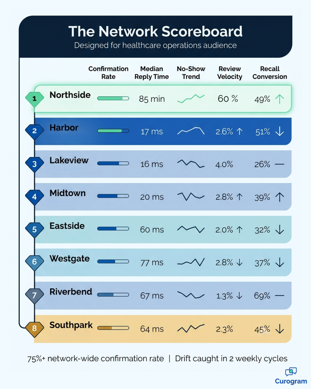
Each site gets scored on the metrics that predict schedule health. The network view then stacks every clinic from best to worst.

  • Confirmation rate the share of booked visits patients actively confirm
  • Median reply timehow long patients wait to hear back from a human
  • No-show trend the direction of travel week to week, not just a flat average
  • Review velocity new public reviews earned each month
  • Campaign conversionrecall outreach that turns into a booked visit

Filter any of them by site, service line, or date range. When you benchmark locations on confirmation rate, the ranking shows up right away. It is uncomfortable in the most useful way.

Network scoreboard infographic ranking eight clinic locations on eCW engagement metrics

Where the numbers connect

Metrics tie back to your eClinicalWorks visit outcomes. So engagement data sits next to the revenue data your leaders already read.

A confirmation rate stops being a soft number. It sits beside the fill rate and the money it drives.

That is what makes per-location analytics medical group leaders can compare worth the meeting time. The dashboard is not scoring how many texts you sent. It is scoring how well your schedule holds.

No-show trend reporting by site works the same way. You are not watching message volume. You are watching whether empty chairs at one clinic are growing while another's shrink.

No-shows cost you money! Reduce missed appointments by up to 75% with Curogram's automated, customizable smart reminders.  

Built for how leaders actually work

Each regional manager sees only their own sites. Network leaders see the full rollup. Weekly exports and standing views give COOs a real rhythm: rank, dig in, coach, check again.

The multi-site operations KPI healthcare groups miss most is reply speed. It is also the quickest one to fix. Patient response time metrics expose it in a single column.

What Changes When Engagement Becomes a Weekly Number

The biggest change is not technical. It is the meeting.

Conversations that used to open with "I think Eastside has been struggling" now open with a ranked list. Nobody argues about whether a problem exists, so the discussion moves straight to why, and to what happens next.

Curogram clients hold confirmation rates above 75% network-wide once sites are scored against each other. Drift shows up within two weekly cycles instead of at quarter-end.

In practice, that timing gap is the entire value. A location that slips in January gets corrected in January, rather than discovered in April after 90 days of empty appointment slots.

Three things a scoreboard makes possible

  1. You find the real top performer. Not the site with the most confident manager. The one whose numbers hold up.
  2. You make their method teachable. Once you know who replies in six minutes instead of six hours, you can write it down and roll it out.
  3. You narrow the variance. Networks improve fastest when average locations move toward the leader, not when the weakest one gets scolded.

The results appear in numbers your leadership already tracks. Atlas Medical Center reduced no-shows from 14.20% to 4.91% in three months with Curogram, a 65% improvement. Covina Arthritic Clinic went from 369 monthly confirmations to more than 1,100.

For your team, a shift like Atlas's at a 1,200-visit clinic means roughly 111 recovered appointments a month. At $125 each, that is about $13,875 monthly, or $166,500 a year, from a single location.

There is a staffing return as well. Practices using automated confirmations and two-way texting report front desk productivity gains above 30%, largely because staff stop making confirmation calls that text messages handle at a 98% open rate.

Dashboards do not fix problems. Attention fixes problems. Dashboards decide where your attention goes.

Turn On the Lights Before Your Next Ops Review

Try the test at your next leadership meeting. Ask for last week's confirmation rate by location.

If nobody can answer within a minute, you have just located your blind spot, and it has almost certainly been there a while.

That gap is not a failure of your team or your EHR. Your eClinicalWorks system does its job very well. It holds your clinical and billing truth with real accuracy, and no dashboard should try to replace it.

What it does not hold is your patients' side of the story. Whether they confirmed. How fast someone wrote back. Whether they returned after a recall text.

Those signals sit outside the chart. Right now, they sit outside your reporting too.

The opportunity here is unusually clean. How patients respond clearly drives revenue, and almost nobody measures it location by location. That combination means the improvement is available to whoever looks first.

Location-level patient engagement reporting for eClinicalWorks networks makes that check routine. Confirmations, reply speed, no-show direction, review growth, and campaign results, ranked across every clinic you run, refreshed weekly.

Not a data warehouse. Not a six-month build. Just a dashboard your messaging platform fills on its own, week after week.

Groups that adopt this rarely describe it as an analytics upgrade. They describe it as finally being able to manage something they were already accountable for.

You can see exactly how this looks against your own network. Schedule a demo and we will set up the scoreboard using your real location list. Then we will show you the first ranking live, on your numbers


Frequently Asked Questions

Does this require a data warehouse or a BI project?

No. The dashboard is built into Curogram. Metrics come straight from the messaging the platform already handles. There is nothing to build and no analyst to wait on. Most networks see their first ranked view during setup, not months later.

Can regional managers see only their own locations?

Yes. Each user is scoped to the sites they own, while network leaders see the full rollup. A regional director reviews their five clinics. The COO reviews all twenty. Everyone works from the same numbers at their own level, which ends most reporting arguments before they start.

Is patient-level data shown in these reports?

Dashboards show summary performance metrics, not chart detail. Patient conversations stay locked down and fully tracked under the same HIPAA-compliant, SOC 2 Type II certified platform that runs your messaging. Who can read a report and who can read a message thread are set separately.

How fast can we tell if a location is slipping?

Most networks catch real drift within two weekly cycles. Metrics refresh as messages move, not at month-end. So a rising no-show trend or a slower reply time shows up while the fix is still small. That timing is the difference between coaching and cleanup.

Do these metrics connect back to eClinicalWorks data?

Yes. Engagement metrics tie to visit outcomes in eClinicalWorks. Confirmation and reply numbers sit right next to the schedule and revenue figures your leaders already read. That link is what keeps the dashboard from turning into one more report nobody opens.