

6 min read

Per-Location Engagement Analytics for athenahealth

Per-Location Engagement Analytics for athenahealth
💡Location-level patient engagement reporting for athenahealth networks brings benchmark discipline to the one layer that never had it.

athenahealth already benchmarks hard: its Insights Dashboard draws on 315 million annual claims and 72 million patients, and offers to compare KPIs like patient outcomes, billing efficiency, and practice revenue against practices of similar size, specialty, and location.

Every one of those domains is financial, clinical, or payer. None of them is communication. A network that can name its own collections rank still can't say which of its sites answers patients fastest.

Curogram produces the missing numbers as a byproduct of the texting, reminders, and campaigns already running. It then presents them the way this culture manages everything else: ranked, trended, per location, reviewed weekly. Networks managing against the scoreboard hold confirmations above 75%, based on our internal data.


Ask a multi-site athenahealth network how its collections compare to peers, and you'll get a percentile inside a minute. The Insights Dashboard is built for that answer. athenahealth puts 315 million annual claims and 72 million patients behind it. The pitch is plain: compare KPIs like patient outcomes, billing efficiency, and practice revenue against practices of similar size, specialty, and location.

Now ask the same network which of its own locations answers a patient's question fastest.

Someone offers an impression after a pause. Westside seems slow. Harbor is understaffed. Nobody is being lazy — the number has never existed to be looked up.

Read athenahealth's own benchmark list again, and the pattern is clean. Outcomes, billing, revenue, reimbursement rates, disease prevalence, payer trends. Financial, clinical, payer.

The communication layer appears nowhere on that list. The reminder reporting that does ship works one message at a time: did this patient confirm? Did this message reach her?

Our claim: these organizations are not bad at measurement. They are strong at it wherever the data has been standardized.

The engagement layer is the last part of the business still running on anecdote. The gap is a supply problem rather than a culture problem, and it closes as soon as the data exists in comparable form.

Below: the five metrics a network scoreboard needs, why those numbers already exist, how a ranked review changes what a meeting can decide, and what to ask for first.

The Villain: The Network Blind Spot

A Benchmark Culture With One Missing Column

Rank is already the house language in these organizations. Quarterly reviews open with it.

That's what makes this gap odd. A regional VP can tell you her network sits above the median on days in AR and below it on clean claim rate. Then she'll guess about response times. She isn't careless. The communication layer never produced a number anyone could rank.

Impressions fill the gap, and they carry a bias. They favor whoever speaks up.

The Ops Review That Debates the Wrong Site

Watch what the vacuum costs in one meeting.

Staffing on the westside clinics is the agenda item. Two managers argue they're drowning. A third stays quiet. Westside gets the headcount, because Westside made the case.

Nobody in the room knows Westside's response times are already the network's best. Nobody knows the quiet location has been slowest for five months.

Neither fact was available, so neither entered the debate. A real staffing decision got made on the only evidence in the room, which was volume of complaints.

What a Year of Invisibility Costs

A weak site survives exactly where nothing looks at it.

One site can run a 20% no-show rate for four straight quarters. That same network would escalate a two-point collections drift inside a week.

Practices lose $20,000 to $30,000 a month to missed visits, based on figures we see in prospect schedule reviews. A year of that is a seven-figure question nobody raised.

Same organization, same leadership, same discipline. One variable separates them: whether the number showed up on a report.

Best Practices Can't Travel Without a Name

Somewhere in the network, one location is very good at this.

Her team answers billing questions before lunch and confirms nearly everything by text. That playbook is teachable, and it's stuck in her building.

No report names her as the one to learn from. Multi-site operations KPIs work by naming a top performer and copying her. With no ranking, there is nobody to copy.

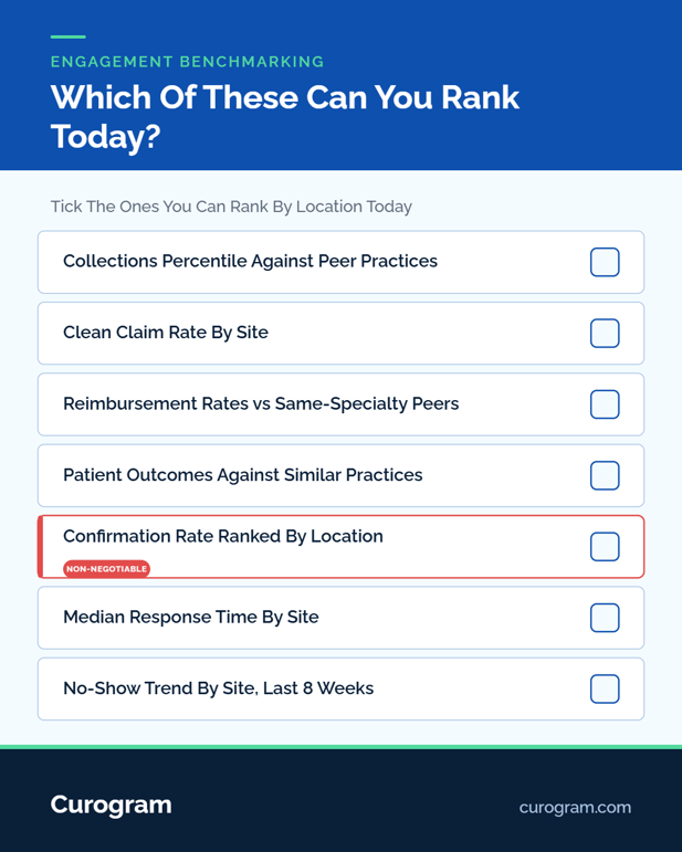
Checklist of engagement benchmarks a medical network should rank

The Guide: The Network Scoreboard

Measurement as a Byproduct, Not a Project

Most leaders expect engagement analytics to mean a data warehouse, an analyst, and two quarters.

That holds when the numbers must be assembled from systems never built to produce them. It stops holding when the measuring happens inside the tool doing the work. Every reminder sent, every reply received, every campaign message already carries a timestamp, a location, and an outcome.

Counting them is arithmetic on data that already exists. A scoreboard here is a view, so standing it up is a setup task rather than a build.

The Five Numbers Worth Ranking

Engagement is not one metric. A per-location analytics view for an enterprise network needs enough columns to find a cause, not just flag a site.

Metric

What it tells you

Review cadence

Confirmation rate

Whether patients are answering at all

Weekly

Median response time

How long a patient waits for a human

Weekly

No-show trend by site

Whether attendance is moving, and which way

Weekly

Review velocity

Whether reputation is being fed or neglected

Monthly

Campaign conversion

Whether recall and outreach actually books

Per campaign


Confirmation rate and response time move first and predict the rest. No-show trend by site is the number leadership already understands, so it's the one that wins the meeting's attention.

Tying Engagement Numbers to Revenue Numbers

An engagement metric with no tie to the schedule stays a curiosity.

These metrics tie to appointment outcomes on the athenahealth schedule, so a confirmation rate sits next to the slots it filled. That link moves the scoreboard out of a communications report and into the operating review. A regional administrator can then argue for a hire in the same currency as everyone else at the table.

An athenahealth communication performance dashboard earns its slot by speaking the language the agenda already uses.

Curogram Highlight: Per-Location Dashboards

Per-Location Dashboards rank every site on five numbers: confirmation rate, median response time, no-show trend, review velocity, and campaign conversion. Network rollups sit above them.

Views filter by location, service line, and period. A service-line lead sees her own ranking; a regional admin sees hers.

Role-based access scopes each user to their own sites. Network leadership sees the full ranking, so one set of numbers stays in play at every level.

None of this is a separate reporting product. The numbers come from work the platform already does, so there's no warehouse to build and no analyst to wait on. Dashboards show totals and rates.

The threads behind them stay access-controlled and auditable, on a HIPAA-compliant, SOC 2 Type II certified platform, like Curogram.

Engagement benchmark data reaches leadership in the format leadership already reads.

The Success: Managed Because Measured

What the First Ranked Review Actually Does

First meetings where engagement arrives ranked run short and a little tense.

Someone's location is last. That is the mechanism doing its job. A drifting site shows up within two weekly cycles. On a quarterly rhythm, a bad setup can run for months before anyone looks.

Networks managing against the scoreboard hold confirmations above 75% across locations, based on our internal data.

Atlas Medical Center cut no-shows from 14.20% to 4.91% in three months on a two-way sequence, again from our internal case data. A weekly ranking makes that kind of move visible while it happens.

Anecdote Meetings Become Ranked Reviews

Engagement gets the treatment collections has had for years: a number, an owner, and a trend line.

Decisions change with it. "Harbor feels slow" supports nothing anyone can defend in a review. "Harbor's median response time is 19 hours against a network median of 4, on 12% below-average volume" supports a specific one. It also survives a challenge from the manager it concerns.

Coaching improves for the same reason. Opening with a shared number skips the argument about whether a problem exists, which is where most of these conversations used to end.

One caution worth building in from week one: rank the sites, then check volume before drawing a conclusion. A location handling twice the message load will look worse on median response time while working harder than the site above it.

A scoreboard that gets used to punish rather than diagnose stops being trusted by the people whose numbers it reports.

Variance Narrows From the Top

Once the best location is named, her methods stop being local.

Study what she does, write it down, roll it out, then watch the ranking to see if it took. That loop needs a named top performer to start, which is what the scoreboard supplies.

Recall campaigns show this clearly. At one multi-location practice, 35% of patients who got an SMS recall booked within a month.

That was 1,240 patients seen from recall messages alone, from our internal case data. A network that can see which sites convert like that can copy them.

Reminder standardization is the next lever, once the ranking shows where settings have drifted.

Conclusion: Benchmark Your Own Locations

Your network already knows how it ranks against practices of similar size and specialty. It cannot yet rank its own sites against each other on the layer that decides whether tomorrow's schedule fills.

Ask for last week's confirmation rate ranked by location. If the answer takes more than a minute, you've found the blind spot. Its size is the number of sites you couldn't place.

Book a demo, and we'll stand the scoreboard up against your real location list, then show the first ranking live.


Frequently Asked Questions

How does this work without a BI project or data warehouse?

The numbers come from work the platform already does, so there's nothing to build and no analyst to wait on. Setup is one step against your location list.

How do regional managers see only the locations they own?

Role-based access scopes each user to their own sites, while network leadership sees the full ranking. Everyone works from one set of numbers, so regional and network reviews stay consistent.

What protects patient privacy in per-location reporting?

Dashboards show totals and rates rather than conversations. The threads behind them stay access-controlled and auditable, on a HIPAA-compliant, SOC 2 Type II-certified platform.

Why do engagement metrics belong next to financial metrics?

They tie to appointment outcomes on the athenahealth schedule, so a confirmation rate connects to the slots it filled. A regional admin can then argue for staffing in the currency the operating review already uses.

How quickly does a drifting location become visible?

Within two weekly cycles. Confirmation rate and median response time both move before no-show rate does, so a slipping site shows on the ranking weeks before attendance reflects it.