
 Aubreigh Lee Daculug
The Connection Between Online Ratings and New Patient Volume
💡 A 4.2-star aggregate rating can hide a serious problem. One provider scoring 4.8 and another scoring 3.1 average out to "satisfactory" — but the...
Averages are excellent at hiding problems.
Your practice shows a comfortable 4.2-star rating. Patients seem happy. New ones keep walking through the door. On paper, things look fine.
Then a patient calls to switch providers. Then another. Then a third. Soon your front desk is fielding complaints about one specific clinician — and you realize the 4.2 average has been carrying a 3.1-star problem for months.
That's the trap baked into most reputation reports. They measure the practice as a whole, not the providers inside it. A strong performer at 4.8 quietly props up a struggling colleague at 3.1, and the average makes everything look fine until it isn't.
This is why benchmarking provider satisfaction scores across your medical practice matters more than tracking a single number on Google. When you break ratings down by individual provider, the picture changes completely. You see who's driving 5-star reviews. You see who's quietly losing patients. You also see whether a low score reflects clinical concerns or something fixable like scheduling or front-desk delays.
Here's the part that surprises most practice managers.
The data isn't hard to capture. It's hard to act on without the right structure. Most practice management systems aren't built to surface provider-level variation, so they default to reporting aggregate numbers that fit cleanly on a dashboard.
This guide walks through how to use provider patient satisfaction analytics to find your top performers, spot performance gaps before they turn into turnover, and build a coaching system grounded in real patient feedback rather than gut feeling.
By the end, you'll know exactly how to measure provider performance patient satisfaction at a level that drives meaningful change for your practice. That's the goal — better data leading to better decisions, faster.
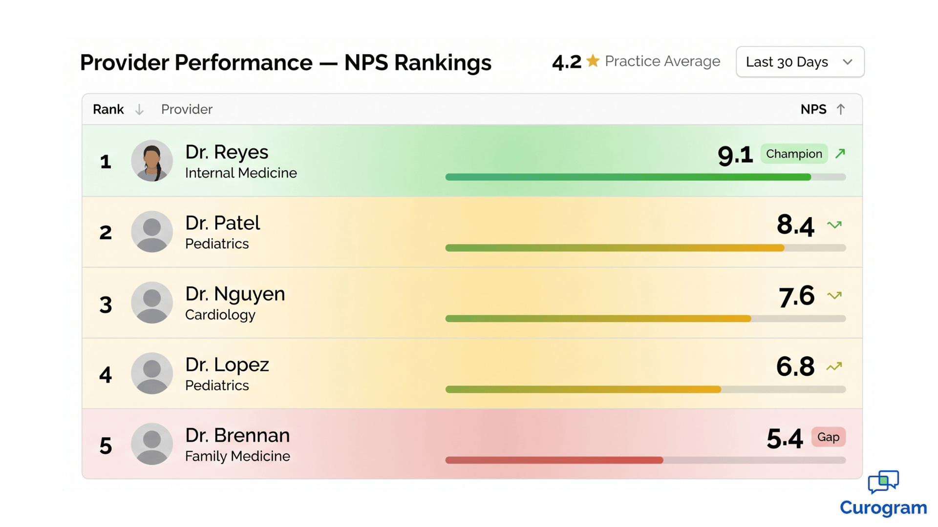
A 4.2-star average sounds healthy. But that number is the result of math, not insight.
Imagine three providers in your practice. Two consistently score 4.8 stars. One scores 3.1. The average lands at 4.2 — perfectly respectable on a Google Business Profile, but completely misleading for management decisions.
This is the aggregate rating blind spot. Your strongest providers are absorbing the impact of your weakest, and you can't see the imbalance because your reporting layer flattens everything into one number.
The problem compounds over time. New patients arrive expecting the experience your top providers deliver. When they get assigned to the underperformer instead, the disappointment is sharper because the bar was set high. They're not comparing the visit to nothing — they're comparing it to the reviews that brought them in.
The blind spot is systematic across the industry. Most practices review aggregate metrics because that's what their systems display. Drilling into provider-level performance takes intentional dashboard design and structured feedback collection.
Leadership teams also tend to trust the aggregate because it's stable. Star ratings shift slowly, so a 4.2 last quarter and a 4.2 this quarter feels like steady performance. In reality, that stability can mean a struggling provider is exactly as struggling as before — and your top performers are working harder to mask it.
The cost? Low-performing providers stay invisible until patients vote with their feet. No-shows climb. Complaints surface. Patients quietly transfer to a competitor — and the practice loses revenue it never realized was at risk.
What makes this especially painful is the lag. By the time the aggregate finally drops from 4.2 to 3.9, dozens of patients have already churned. You're now reacting to a problem that started six months ago, with patients you'll never get back.
Here's a quick example of what the gap can cost a mid-sized practice:
| Scenario | Aggregate Rating | Hidden Issue | Estimated Annual Impact |
|---|---|---|---|
| 3 providers, 1 underperformer | 4.2 stars | 1 provider at 3.1 | ~120 patient transfers |
| Patient lifetime value (avg) | $1,500 | — | $180,000+ in lost revenue |
That's a back-of-the-envelope calculation, but the stakes are real.
When you can't see provider-level performance, you can't fix it. The longer the gap stays hidden, the more it costs in turnover, lost patients, and reviews you'll spend the next year trying to repair.
Every practice has one. The provider patients ask for by name. The one whose schedule fills first. The one whose patients leave reviews without being asked.
When this provider scores 4.8 or higher on patient satisfaction, they're not just performing well — they're a strategic asset.
They drive higher NPS scores. They generate the bulk of your 5-star reviews. They keep the practice afloat when other providers are still finding their rhythm.
The financial impact often goes unrecognized. A single top performer can be responsible for 40–60% of new patient referrals through word-of-mouth and online reviews. Lose them, and the referral pipeline doesn't just shrink — it changes shape. Replacing that volume through paid acquisition typically costs 5–10x what retention would have.
But top performers offer something more valuable than great scores. They offer a blueprint.
When you have provider patient satisfaction analytics that go beyond a single number, you can study what your top performers actually do differently.
Common patterns include:
These behaviors aren't magic — they're patterns. And patterns can be taught.
Once you have top performing providers patient feedback in front of you, clear themes start to emerge. You can build coaching protocols around those exact behaviors. You can also use those patterns as hiring criteria. The next provider you bring on shouldn't just have credentials — they should match the communication and follow-through profile your patients already love.
Recognition matters here too. Top performers who feel invisible eventually leave for practices that see them.
When you can show a provider the data behind their impact — specific scores, specific themes in their reviews, specific patient retention numbers — you give them a reason to stay that goes beyond compensation.
Think of it this way: a 4.8-star provider isn't just one good clinician. They're a template for the next five.

A provider scoring 3.1 isn't necessarily a clinical problem. That's the most important sentence in this article.
Patient satisfaction measures experience, not medicine — especially in practices relying on HIPAA compliant messaging and digital communication tools. The dimensions driving scores are communication clarity, wait time perception, attentiveness, and follow-through. A clinically excellent physician can score low on these and still deliver outstanding care.
The mistake most practices make is treating a low score as a single signal. They see 3.1 and think "this provider has a problem" — when the score is actually four different signals averaged together. One of those four might be the issue. The other three might be excellent.
This is why dimension-level scoring matters. Without it, you're flying blind.
Consider a real breakdown:
| Dimension | Score (out of 10) |
|---|---|
| Clinical Competency | 9.2 |
| Communication | 8.7 |
| Wait Time Perception | 6.1 |
| Follow-up Care | 8.9 |
That's a strong provider with one specific gap:
Wait time. The fix isn't clinical coaching. It's scheduling.
Maybe the provider is overbooked. Maybe the front desk is double-booking new patients into existing slots. Either way, the issue lives in operations, not in the exam room.
In one practice scenario, a provider scoring 4.7 overall had a wait time score of 3.2.
After digging in, the team realized the provider wasn't slow — the location was over-scheduled by about 18% during peak hours.
They reduced bookings by two patients per day, and within 60 days, the wait time score climbed to 7.4.
The coaching wasn't clinical. It wasn't even about the provider. It was operational.
This kind of misdiagnosis is more common than most leaders realize.
When a provider gets pulled into a performance conversation about a problem they didn't create, the damage isn't just to the score — it's to trust.
Providers who feel unfairly evaluated disengage from feedback systems entirely, which makes future improvement harder for everyone.
This is why a physician satisfaction score dashboard matters so much. When scores are broken down by dimension, you can see exactly where the breakdown is. You can match the fix to the actual problem instead of misdiagnosing the cause and frustrating a clinician who didn't deserve it.
Dimension data also changes the tone of coaching conversations. Instead of saying "your scores are low," you can say "your communication and clinical scores are excellent — let's talk about what's happening with wait time." That reframe turns a defensive moment into a problem-solving one.

If you run a multi-site group, here's a scenario worth paying attention to. The same provider scores 4.8 at Location A and 3.9 at Location B.
The instinct is to question the provider. The data says otherwise.
When a clinician's behavior is consistent but their scores swing across sites, the problem isn't them. It's the environment.
Location-level factors that commonly drag scores down include:
This is exactly where multi-location provider benchmarking changes the game. It separates provider-level issues from location-level issues — a distinction most practices can't make without structured data.
Without that visibility, the consequences are real. You might coach a provider who didn't need coaching. You might lose a strong clinician to frustration. You might even make termination decisions based on data that was never about them.
The reverse is also true. A location with consistently high scores across multiple providers tells you something is working there — staff dynamics, workflow design, facility quality, or all three. That's a model worth studying and replicating across other sites.
A simple comparison illustrates the point:
| Provider | Location A NPS | Location B NPS | Likely Cause |
|---|---|---|---|
| Dr. Smith | 9.1 | 6.4 | Location B operations |
| Dr. Patel | 8.9 | 8.7 | Consistent — provider profile |
| Dr. Lopez | 5.2 | 5.1 | Provider-level coaching need |
The pattern matters more than any single number. Consistent scores across sites suggest provider-level patterns. Inconsistent scores point to location operations.
This data also informs smarter scheduling. If you know Location B underperforms, you can avoid sending your top performers there until the operational issues are fixed — protecting both their scores and your patient experience while you address the root cause.

For multi-site groups, this distinction can save thousands of dollars in turnover costs and prevent the loss of high-quality clinicians caught in difficult environments.
Patient satisfaction scores work best when they're treated as one input — not the verdict.
A provider with a 4.8 satisfaction score and low patient volume might be exceptional at relationships but need productivity coaching. A provider with high volume and a 3.9 satisfaction score might be efficient but need help slowing down with patients. Neither one is "good" or "bad." They're different profiles needing different conversations.
The mistake to avoid is using satisfaction as the only lens. A practice that ranks providers purely on patient feedback ends up rewarding the most agreeable clinicians, not necessarily the most effective ones. Patient satisfaction is one signal among several — and it's most useful when paired with the others.
This is why pairing satisfaction data with productivity, quality, and documentation metrics creates a balanced view. Quarterly reviews that integrate all four dimensions surface real growth opportunities.
Think about what that looks like in practice.
A provider with strong satisfaction (4.8) but low productivity needs workflow coaching — they're connecting well with patients but spending too much time per visit. A provider with high productivity but a 3.9 satisfaction score needs the opposite: communication coaching and permission to slow down. And a provider sitting low on both fronts (3.7 satisfaction, low productivity) needs a full development plan, not a single fix.
Cadence matters as much as content. Quarterly reviews give you statistical reliability, but waiting that long means small issues compound into bigger ones. Monthly check-ins on dimension-level trends catch problems early — before they show up in churn or turnover.
The takeaway is straightforward. Satisfaction data drives development, not punishment. The goal is steady improvement based on real patient feedback, captured systematically and integrated into how you manage performance.
When this works, providers actually appreciate the data. They want to know where they stand. They want specifics they can act on. A vague "patients seem unhappy" gets you nowhere. A specific "your wait time score is 3.2 — let's look at scheduling" gives them something concrete to fix.
Over time, this approach changes the culture around feedback. Providers stop seeing satisfaction scores as a threat and start treating them as a tool. That shift alone — from defensive to curious — is often what separates practices that improve year over year from those that plateau.
That's the difference between data that punishes and data that develops.
Aggregate ratings will keep telling you everything is fine. Until suddenly it isn't.
The practices that grow steadily aren't the ones with the highest star ratings. They're the ones that know exactly which providers drive their reputation, which providers need support, and which dimensions of patient experience need work.
That's the difference between a number on a dashboard and a system you can actually manage.
When you combine provider-level satisfaction data with operational context — scheduling, location performance, productivity — you stop guessing. You start coaching based on evidence. You hire based on patterns that work. You retain top performers because you can show them, with data, exactly what makes them exceptional.
For multi-location groups, the impact compounds. Every site gets visibility. Every provider gets clarity. Every coaching conversation gets grounded in something more useful than gut feeling.
Curogram's Insight Suite was built for exactly this kind of visibility. It captures patient feedback at the visit level, segments it by provider and location, and surfaces the dimensions that actually need attention. Your practice gets a clear view of who's leading, who's gapping, and where the real opportunities live.
If you're tired of looking at aggregate numbers that hide the truth, it's time to see what your data actually says.
Book a demo with Curogram and we'll walk you through how the Insight Suite turns patient satisfaction into a practice management tool — not just a vanity metric. You'll see provider-level dashboards, location benchmarking, and dimension scoring applied to real practice data.
Frequently Asked Questions

💡 A 4.2-star aggregate rating can hide a serious problem. One provider scoring 4.8 and another scoring 3.1 average out to "satisfactory" — but the...

💡 A 4.2-star practice rating can hide a 3.1-star provider. Aggregate ratings average high performers against low ones, masking real performance...

💡 Patient NPS sentiment capture healthcare feedback loop systems turn every appointment into measurable data. They route happy patients toward...