

10 min read
The Connection Between Online Ratings and New Patient Volume
Aubreigh Lee Daculug
:
May 31, 2026
Provider satisfaction scores benchmarking medical practice teams against each other reveals who drives loyalty, who needs coaching, and which issues are actually location-based. Dimension-level data turns vague ratings into specific actions: shorter wait times, clearer communication, better follow-up.
The result? Top performers become teachers, gaps become coaching plans, and patient experience stops being a guessing game. Tools like Curogram make this data continuous, automatic, and easy to act on — without adding work to your front desk.
Your practice has a 4.2-star aggregate rating. On paper, that looks fine. Online, it looks competitive. So why are some patients quietly switching providers?
Here's the part most dashboards won't show you. That 4.2 is an average. And averages lie.
Behind it, you might have two providers patients adore — and one that nobody is willing to leave a review about. The math evens out. The damage doesn't. Your best providers are silently carrying someone else's ratings, while your weakest is slowly chipping away at retention, no-shows, and word-of-mouth growth.
The frustrating part? You probably can't tell which is which. Most practices review aggregate metrics because that's what their reporting systems give them. Provider-level visibility takes intentional setup. Without it, you're managing a team while wearing a blindfold.
Now think about what that costs. A single underperforming provider losing 10 patients a month at an average lifetime value of $2,500 quietly drains $25,000 — every month — from your bottom line. That's $300,000 a year you'll never see on an invoice.
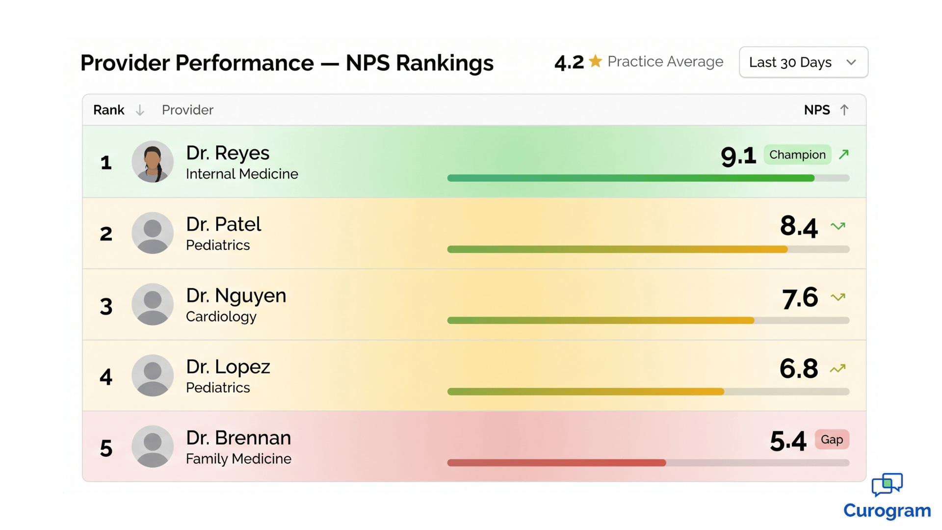
This is where provider patient satisfaction analytics changes the conversation. Instead of one blurry number, you get a clear picture of every clinician on your team: who excels at communication, who's losing patients on wait times, and where coaching will actually move the needle.
In this guide, you'll learn how to measure provider performance patient satisfaction the right way — using NPS, dimension-level scoring, and multi-location benchmarking.
We'll show you what good data looks like, how to read it, and how to turn satisfaction scores into a real performance management tool.
No more guessing. No more averages doing the talking.
Why the Average Star Rating Is Quietly Hurting You
Aggregate ratings are comforting. They're also misleading.
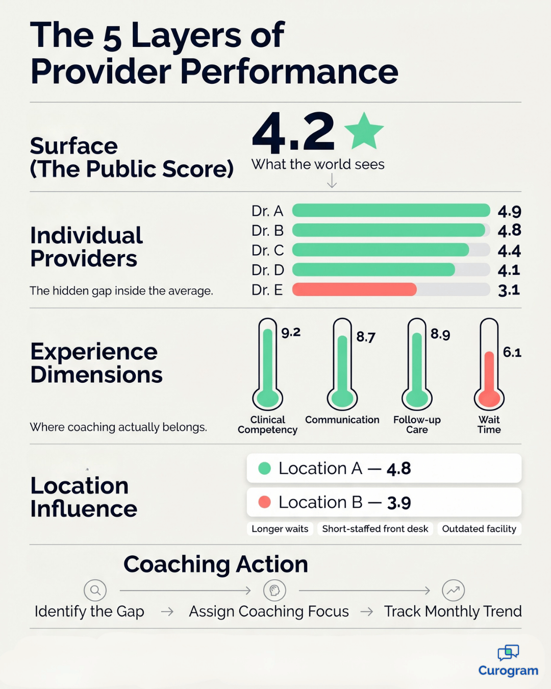
A 4.2-star practice rating sounds healthy until you split it apart. You might find one provider sitting at 4.9, another at 4.7, and a third anchored at 3.1. The average looks acceptable. The reality on the ground is anything but.
The challenge is that most practice owners only see what their software chooses to show them. And right now, most software is built for marketing — not management. It tells you how the practice looks to the public, not how it actually performs from the inside.
Why Practices Default to Aggregate Numbers
This blind spot is structural, not accidental. Most reporting systems were built to surface practice-wide numbers because that's what owners and marketing teams asked for years ago. Granular data takes deliberate dashboard design. Without it, low-performing providers stay invisible — until patients quietly vote with their feet.
There's also a cultural reason this happens. Practice leaders often hesitate to drill into provider-level data because it feels uncomfortable.
Nobody wants to single out a colleague. But avoiding the data doesn't make the problem disappear — it just delays the conversation until the damage is much harder to reverse.
When that happens, the warning signs tend to show up late and all at once:
- Rising no-show rates from a specific provider's panel
- A sudden cluster of complaints to your front desk
- Patient transfers to competitor providers down the street
- A pointed Google review that names a specific clinician
By then, the damage is already done. The goal of provider satisfaction scores benchmarking medical practice operations is to surface these gaps months before they hit your revenue line — while you still have time to coach, adjust, or intervene.
Think of it like a check engine light. Aggregate ratings only flash red when something has already broken. Provider-level data is the dashboard that shows you the small warning signs early — long before the engine seizes.
The Real Value of a Top-Tier Provider
A provider scoring 4.8 or higher isn't just performing well. They're a reputation asset.
These providers tend to communicate clearly, listen attentively, and follow up consistently. They earn higher Net Promoter Scores. They generate the bulk of your 5-star reviews. And in many practices, they're the reason your numbers stay steady when other providers struggle.
Their value goes beyond the ratings dashboard, too. Top-tier providers tend to have stronger patient retention, lower no-show rates, and more referrals.
A patient who loves their doctor will reschedule promptly, show up on time, and tell three friends.
A patient who tolerates their doctor does none of those things.
Top Performers Are Also Your Best Trainers
But here's what's often missed — top performers are also a learning resource. With provider-level data in hand, you can study what makes them effective.
Do they spend slightly more time per patient?
Do they explain treatment plans in a specific order?
Do they follow up the next day with a quick text?
These aren't mysteries you have to solve from scratch. The answers are sitting inside your own practice, attached to one or two clinicians who already do it well. The job is simply to surface what they're doing and document it in a way the rest of your team can learn from.
Once you see those patterns, you can replicate them. Coach other providers using the top performer's habits. Hire new providers using their traits as a benchmark. Build onboarding around what already works inside your walls. That's how a single great clinician quietly raises the standard for the entire team.
It also changes how you protect your best people. When you know exactly who is driving your reputation, you can recognize them, retain them, and shield them from burnout. Losing a top performer to a competitor isn't just a staffing issue — it's a measurable hit to your patient experience scores within weeks.
What Low Scores Actually Mean (It's Not Always Clinical)
When a provider scores 3.1 on patient satisfaction, the instinct is to question their clinical judgment. That instinct is usually wrong.
Patient satisfaction measures experience, not medicine. It captures how communication felt, how long the wait seemed, how attentive the visit was, and whether anyone followed up afterward. A clinically excellent provider can score low simply because they rush explanations or run chronically late.
This distinction matters because the wrong diagnosis leads to the wrong fix. Coaching a provider on clinical skills when the real issue is wait time wastes everyone's time — and frustrates a clinician who knows their medicine is solid.

Why Dimension-Level Scoring Changes Everything
This is why dimension-level scoring matters so much. A single overall score buries the answer. Dimension-level scoring exposes it.
A provider might post these numbers on a physician satisfaction score dashboard:
| Dimension | Score |
|---|---|
| Clinical Competency | 9.2 |
| Communication | 8.7 |
| Wait Time Perception | 6.1 |
| Follow-up Care | 8.9 |
The clinical and follow-up scores are excellent. The communication score is solid. The wait time score is the gap. That's not a coaching conversation about medicine — it's a scheduling conversation about flow.
Notice what this also does for the conversation itself. Instead of telling a provider "patients aren't happy with you," you can say "patients love your clinical care and follow-up — but the wait is hurting their overall experience, and we need to fix it together."
That's a coaching conversation any good provider will engage with.
A Real-World Example
Take a real-world example. A provider once scored 4.7 overall but 3.2 on wait time perception. After investigation, the issue wasn't the provider at all. The location was overbooked. Once scheduling was adjusted and time per patient increased by 4 minutes, satisfaction climbed within two months. The fix was operational, not clinical.
What's interesting about this case is what would have happened without dimension-level data.
The provider would have been flagged as "underperforming," likely received vague feedback, and grown frustrated with leadership for missing the obvious.
The real cause — overbooking — would have continued to drag down every other provider at that location too.
In practice, this saves you from coaching the wrong person about the wrong thing. It also saves you from operational blind spots that quietly damage your entire team.
Comparing Providers Across Multiple Locations
If you run more than one location, the data gets even more interesting — and more honest.
Multi-location provider benchmarking lets you spot something most practices miss: the same provider scoring differently at different sites. Imagine Dr. Lopez scoring 4.8 at Location A and 3.9 at Location B. That 0.9-point swing isn't about Dr. Lopez. It's about Location B.
When the same human being delivers care two different ways, depending on the building, something around them is changing the patient experience. Your job is to find what.
The cause is usually environmental, not personal. A few common culprits include:
- Longer average wait times at the underperforming site
- A short-staffed or undertrained front desk team
- Outdated facilities that affect patient perception before the visit even starts
The provider's behavior is consistent — the environment around them isn't. Without that location-level context, you'd be tempted to "address" the provider. Coach them, warn them, maybe even let them go.
All for a problem that has nothing to do with how they practice medicine.
This is the kind of insight that protects good providers and forces you to look honestly at your operations. It also prevents one of the costliest mistakes in healthcare HR: losing a great clinician over data you misread.
There's another angle worth flagging. Multi-location benchmarking can also reveal which sites are quietly outperforming on experience — even if their volume is lower.
A small location with a 4.7 average across all providers is doing something your bigger site isn't.
That's a playbook waiting to be copied.

Turning Satisfaction Data into Smarter Performance Reviews
Patient satisfaction scores are coaching fuel — not a verdict.
Used well, they sit alongside other performance signals: patient volume, case complexity, documentation quality, and productivity.
A provider with 4.8 satisfaction but lower volume might be exceptional with patients but slow on throughput.
A provider with high volume but a 3.9 score might be efficient but rushing the human side.
Neither of those providers is "bad." Both are valuable. They just need different kinds of support to reach their next level.
Building a Balanced Performance View
Quarterly reviews that combine satisfaction data with productivity create a balanced picture.
You might see this kind of distribution:
| Provider | Patient Satisfaction | Patient Volume | Coaching Focus |
|---|---|---|---|
| Provider A | 4.8 | Below average | Productivity |
| Provider B | 3.9 | Above average | Communication |
| Provider C | 4.2 | Average | Both |
Now you're not having a vague "we need to talk about your numbers" conversation. You're having a specific one.
Provider A keeps their patient relationships and works on workflow.
Provider B keeps their efficiency and works on bedside manner.
Provider C gets a structured plan for both.
This is what top performing providers patient feedback data is meant to do — guide development, not punish people. The providers themselves usually appreciate the clarity.
Most clinicians want to improve;
They just need to know exactly where.
It also changes the energy of performance reviews. Instead of feeling like an evaluation, the meeting becomes a working session. Both sides are looking at the same dashboard, identifying the same gaps, and agreeing on the same next steps.
Spotting Trouble Before It Becomes a Crisis
When you combine this with monthly trending, you also catch issues early. A provider whose communication score drops from 8.7 to 7.4 in 60 days is signaling burnout, frustration, or a workflow problem.
That's a conversation you want to have at month two — not month twelve, after a patient complaint forces it.
Early signals are also cheaper to fix.
A small adjustment to scheduling, a brief coaching session, or a quick check-in about workload can turn a downward trend around in weeks. Wait too long, and the same fix takes months — if it works at all.
This is the operational difference between practices that grow steadily and ones that lurch from crisis to crisis. The growing practices aren't necessarily smarter or better staffed. They just see problems earlier, when problems are still small.
How Curogram Helps You See What's Really Going On
Most practices don't lack the desire to do this — they lack the data infrastructure.
Building a dimension-level dashboard from scratch is a project. It involves survey design, response collection, data routing, reporting logic, and a way to keep it all updated month after month. Most practices don't have an in-house analytics team, and the ones that do are usually focused on billing, not patient experience.
Curogram closes that gap. Automated post-appointment surveys are sent by text after every visit, capturing feedback at the moment it's freshest. Response rates are dramatically higher than paper or email surveys, often by 4 to 5 times, because patients can answer in 15 seconds from their phone.
That data flows into the Curogram Insight Suite, where it's organized in three ways that matter for performance management:
- By provider — so you see exactly who's driving 5-star reviews and who needs support
- By location — so you can separate provider issues from environmental ones
- By experience dimension — so coaching is specific to communication, wait time, or follow-up
You stop seeing "the practice has a 4.2 rating" and start seeing the story behind it. The result is the kind of physician satisfaction score dashboard that used to require a full analytics team — running automatically, in the background, while your front desk focuses on patients.
There's also a compounding benefit. Because the data is captured continuously, every month adds more clarity. Trends become visible. Outliers become obvious. Coaching decisions stop being judgment calls and start being informed calls — backed by hundreds or thousands of patient responses instead of a handful of recent complaints.
Conclusion
You've spent years building a team of clinicians you trust. You shouldn't have to evaluate them based on a single rounded-off star rating.
The practices growing fastest right now aren't the ones with the most providers or the biggest marketing budgets.
They're the ones who actually know what's happening inside their own four walls. They know which provider is creating loyal patients, which is struggling with communication, and which location needs operational help. They make decisions with data — not gut feel.
That's the difference Curogram is built to deliver. Automated post-appointment surveys collect honest patient feedback while the visit is still fresh.
The Curogram Insight Suite organizes that feedback by provider, location, and experience dimension. You get clarity instead of averages. Coaching plans instead of guesswork. Real visibility instead of quarterly surprises.
And because everything runs in the background, your front desk team doesn't take on extra work. Surveys send themselves. Reviews flow in. Reports update automatically. You spend less time chasing data and more time using it.
Whether you run a solo practice trying to understand your one rating, or a multi-location group trying to manage 20 providers across 8 locations, the principle is the same. Better data leads to better decisions. Better decisions lead to better patients, better staff, and a stronger bottom line.
Book a demo today and see exactly what your provider-level data looks like. We'll walk you through your top performers, your hidden gaps, and the coaching opportunities you didn't know you had. No pressure. No long pitch. Just a clearer picture of what's actually happening in your practice — and a simple way to act on it.
Frequently Asked Questions
Tread carefully here. Patient satisfaction is one important dimension of provider performance — but only one. Productivity, clinical quality, and compliance also matter. Some practices link satisfaction to bonuses; others use it strictly for coaching. The risk of tying it directly to pay is that providers may unconsciously avoid difficult patients or chase the metric instead of focusing on care. The strongest approach is using satisfaction as one input in a holistic performance review, paired with volume and quality data.
That's a fair reaction, and the data should be ready for it. Always present scores with sample size and dimension-level detail. A provider scoring 4.1 overall but 8.9 on clinical competency and 3.2 on wait time can see exactly where the issue lives. If responses are below 20, the score is statistically thin and coaching should wait until more data accumulates. Frame the data as operational feedback — never as a verdict on their value.
Aggregate monthly at minimum, with weekly trending for real-time visibility. Monthly cadence gives you meaningful sample sizes while smoothing out daily noise. Quarterly or annual reviews are too slow — by the time you spot a problem, it's already cost you patients. With monthly reviews, you can intervene early, while coaching is still light and the issue is still small.
A star rating tells you how patients felt about a single visit. NPS (Net Promoter Score) tells you whether they'd recommend you to friends and family. NPS is a stronger predictor of growth because it measures loyalty, not just satisfaction. Most strong practices track both — star ratings for review-site performance, NPS for relationship strength.
Healthcare averages tend to sit around 30 to 40. Strong practices score 50 or above. Top-performing providers within those practices often hit 70 or higher. If you're below 30, you have meaningful experience gaps to address. If you're above 60, you have a reputation engine — and you should be studying what's working so you can scale it across the team.