
.jpg) Mira Gwehn Revilla
Mira Gwehn Revilla

Curogram collects those numbers as patient conversations move through its shared inbox, so nobody has to run a time study or fill out a log.
- Messages handled per location each week, and per staffer on shift
- Median first-response time, split by queue, since a scheduling text needs a faster answer than a billing question
- Resolution rate, so a quick reply that leaves the patient waiting doesn’t count as done
- Hourly volume curves that show when each desk gets buried
- Confirmation follow-through, with above 75% as the baseline based on our internal data
Most multi-location groups make front desk staffing calls on weaker proof than they’d accept for a supply order. Nobody reorders gloves because one office said it felt low. Hiring and coaching often get decided that way.
You’ve probably seen the pattern. One office manager calls the regional director twice in a week to say her team is swamped, and that office gets the next open hire.
Another office never calls. Its team answers texts through lunch, and the only feedback it gets is a note about slow afternoon callbacks.
That second team may be doing more work, and doing it faster. Nobody knows, because nobody counted. Its call report looks average, since half of that team’s day happens in the text queue.
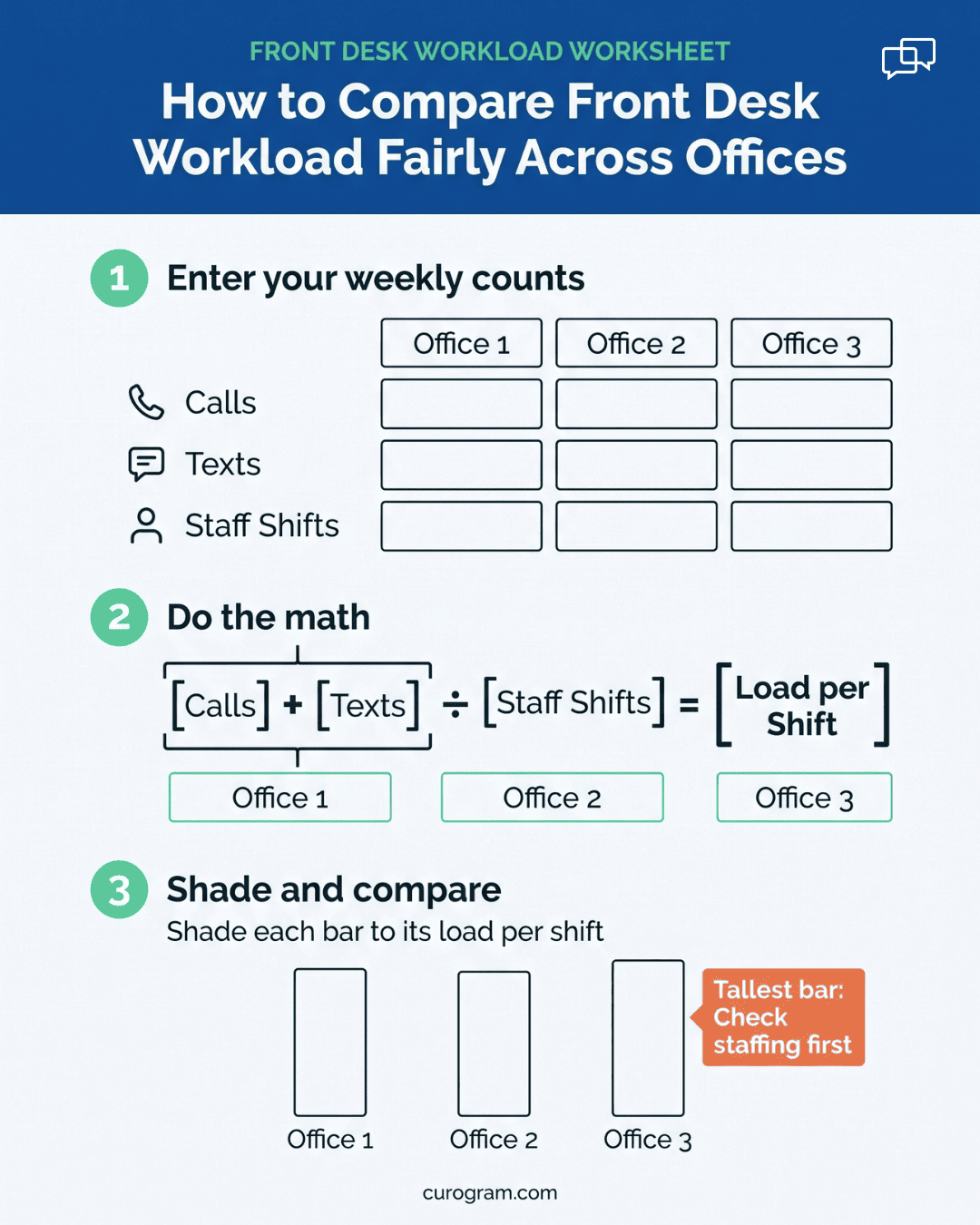
Benchmarking front desk performance across DrChrono locations fixes this, but only when the count is fair. Fair means every desk is measured the same way: all messages, across every channel, set against the staff who were on shift to answer them.
A 9-minute reply at an office handling 300 threads a day is a stronger result than the same reply at an office handling 90. Per-staffer numbers make that gap visible.
We think most groups already own the data they need. Every text, reminder reply, and recall response leaves a timestamp. It just never gets added up by location, so the people making staffing decisions fall back on whoever spoke up last.
A per-location count changes the conversation. “North seems slow” becomes “597 contacts per staffer, with an 11-minute median reply.” A director can act on the second sentence, and North’s team can defend it.
The Unfair Comparison
Your phone system can tell you how many calls rang at each office and how long patients sat on hold. That’s one channel.
A front desk today also handles two-way texts, reminder replies, “can I move my 2:00?” requests, recall responses, intake form questions, and payment links.
None of that shows up in the call report. Some of it lives in a shared inbox, some in DrChrono’s messaging, and some on a staffer’s sticky notes. As more patients text, the call report covers less of the job each month.
Few groups ever add these channels up by office, so no one has a full count of what each desk handles.
Two Offices, Same Headcount
Take two offices that each run three front desk staffers. The numbers below are illustrative, built to show the math.
|
One week (illustrative) |
North Office |
South Office |
|
Front desk staff |
3 |
3 |
|
Phone calls |
610 |
640 |
|
Text threads |
1,180 |
520 |
|
Total patient contacts |
1,790 |
1,160 |
|
Contacts per staffer |
597 |
387 |
|
Median first reply to texts |
11 min |
19 min |
On the call report, North and South look like twins. North even takes slightly fewer calls.
Add the text queue and the ranking flips. North handles 54% more total contacts and replies to texts 8 minutes faster. Its afternoon callbacks run late because staff are working a text queue twice the size of South’s.
Why the Loudest Office Gets the Help
Without workload data, a regional director judges offices by what reaches her desk. That means escalations, patient complaints, and which manager is best at asking for help.
Those signals point the wrong way more often than you’d expect. In the example above, hold-time complaints come from North, because North’s phones wait while its team clears texts. South gets fewer complaints because it has slack.
North’s manager doesn’t call the director, either. She’s covering the check-in window herself three afternoons a week. Being too busy to complain is common at the most loaded desk in a group.
So the squeaky office gets the extra hire. The overloaded office gets a talk about callback times. Each decision gets made in a 10-minute call, with no numbers on the table.
Proof Nobody Would Accept Elsewhere
Think about how the same group decides where to place a new ultrasound machine. It would pull visit volume, referral counts, and scan backlogs by office. Nobody would say, “The East office manager seemed stressed on Friday.”
Front desk staffing rarely gets that standard. The decision to move a staffer from South to North, or the other way, often gets made on a Monday call based on last week’s complaints.
Nobody in that call has seen a message count. Each manager brings a story, and the most vivid story wins.
People decisions end up riding on who complained most recently.
Every Channel in One Count
A fair scoreboard starts with a complete count. Curogram runs texting, appointment reminders, confirmations, recall campaigns, and review requests through one shared inbox that syncs with DrChrono. Each message is tied to a location and a queue as it comes in.
That gives every office the same measure of its text-side workload, counted the same way. Pair it with the call report you already pull, and you finally see the whole job each desk carries.
The count happens in the background. Staff don’t log tasks, tally messages, or estimate their day. A reply sent from the inbox is already timed and tagged.
That matters, because self-reported workload tends to drift toward whoever is most vocal, which is the same bias you’re trying to remove.
Four Numbers Each Office Gets
Curogram’s per-location views track four numbers for each office and queue.
|
Number |
What it tells you |
Watch for |
|
Messages handled |
Total work done, per office and per staffer |
Raw totals without staffing context |
|
Median first-response time |
How long a patient waits for a first human reply |
Mixing fast and slow queues together |
|
Resolution rate |
Share of threads closed with the question answered |
Fast replies that don’t solve anything |
|
Hourly volume curve |
When each desk gets buried during the day |
Staffing that doesn’t match the peaks |
Median is the right front desk response time metric for this job. One thread left open overnight can wreck a weekly average. The median shows what a typical patient waited, which is what you want to compare between offices.
Resolution rate keeps the first number honest. A team can post a 2-minute response time by sending “Got it, will check!” and then going silent for the rest of the day. Reading both numbers together catches that.
The hourly curve answers a different question. It shows whether an office is short-staffed all day or only during its rush. A desk that gets buried from 8:00 to 9:30 may need a staggered start time, which costs far less than a new hire.
Why the DrChrono Sync Matters
Benchmarks need clean location tags. Because Curogram syncs with DrChrono, reminder and confirmation threads tie back to the appointment, including the office where the visit is booked. A patient replying “C” to confirm counts toward the office that will see them.
The sync also shows how automation changes each office’s workload mix. At Covina Arthritic Clinic, confirmations used to need manual staff follow-up.
Based on our internal data, Curogram now confirms more than 1,100 appointments there each month. Those threads still appear in the count, but they no longer eat staff time.
Built for Coaching, Kept at Team Level
We think a per-person leaderboard does more harm than good at a front desk. It pushes staff to grab easy threads and leave the hard billing question for someone else.
Curogram’s views stay at the team and queue level, shown as trends across weeks. A manager can see that North’s scheduling queue slows down every day between 1:00 and 3:00. That’s a staffing pattern to fix, and it doesn’t single anyone out.
Front desk teams tend to welcome this kind of view once they see it. For many of them, it’s the first record that shows how much they actually handle. Share it with them on the same day managers see it, so nobody learns about their own numbers secondhand.

Coaching Where the Data Points
Take a four-office DrChrono group with one open front desk hire. Office B has asked for it twice. The figures in this walkthrough are illustrative.
- Pick the window. Choose two normal weeks with no holiday. Mark any recall or campaign days in advance.
- Pull the four numbers. For each office, get messages handled, median first-response time by queue, resolution rate, and the hourly curve.
- Adjust for staffing. Divide each office’s volume by its front desk staff days. Two part-timers count as one full-time person.
- Line the offices up. Compare per-staffer load next to response time and resolution, never one number alone.
- Talk before deciding. Share each office’s numbers with its manager and ask what the data misses.
The whole pull takes about an hour once the data exists. Most of the work is the conversation in step 5.
What the Group Finds
|
Office (illustrative) |
Threads per staffer per day |
Median first reply |
Resolution rate |
|
A |
62 |
8 min |
91% |
|
B |
41 |
22 min |
78% |
|
C |
88 |
14 min |
84% |
|
D |
45 |
9 min |
93% |
Office C carries more than twice B’s load per person and still replies faster. C gets the hire.
Office B has the lightest load and the slowest replies. Its problem is process, and coaching fits.
In the step 5 talk, B’s manager explains that her team checks the text queue between check-ins, in batches. Some patients get an answer in 2 minutes, and others wait more than an hour.
Office D has a similar load to B and replies in 9 minutes. D keeps saved replies for its 10 most common questions and checks the queue at the top of every hour. Those two habits go into B’s coaching plan, taught by D’s lead.
Curogram Highlight: Team Performance Views
Team Performance Views give administrators a side-by-side look at front desk workload across every location in a DrChrono group.
Each view pulls from the same shared inbox your staff already use for texting, reminders, confirmations, and recall replies, so there’s nothing extra to log.
For each office and queue, the views show messages handled, median first-response time, resolution rate, and an hourly volume curve.
You can filter to a single queue, such as scheduling, to see where patients wait longest. You can also compare one office’s trend against the group median across weeks.
Context sits next to the numbers. Campaign days and volume spikes appear on the same timeline, so a slow Wednesday after a recall batch reads as what it is.
Staffing levels feed the per-staffer figures, which keeps a three-person desk from being judged against a five-person one.
The views stay at the team level. Managers see patterns, such as a 1:00 to 3:00 slowdown or a queue that never clears on Mondays. They don’t get a ranked list of individual staffers, which keeps the tool pointed at workload and coaching.
Because Curogram syncs with DrChrono, appointment-linked threads carry the correct office tag. Confirmations, reminder replies, and recall bookings count toward the location that will see the patient.
A typical use looks like this. An administrator opens the views before a quarterly staffing review, sorts offices by per-staffer load, and checks response time beside it.
The office that needs a hire and the office that needs coaching are usually different, and the views make that plain before the meeting starts.
Conclusion: Be Fair By Being Informed
Front desk teams deserve to be judged on measured work, by a standard every office can see.
That standard sounds obvious. It rarely holds up in practice, because the numbers that would support it are scattered across a phone report, a texting tool, and a manager’s memory. When the count is incomplete, the loudest office fills the gap.
DrChrono runs your schedule and your charts. Curogram handles the patient conversations around them, and that’s where most of a front desk’s day now goes.
Once that work is counted by location and set against the staff on shift, the hardest-working team stops being invisible. It can also show you which team needs a better process, which is a fairer outcome for them too.
Before your next staffing decision, get one week of real per-location volume data. It may reverse the decision. In our example, it did: the office asking loudest had the lightest load, and the quiet office was carrying more than twice the work per person.
Book a demo with our team and we’ll show you what two weeks of benchmark data looks like for a group like yours. Bring your current staffing plan. We’ll put the numbers next to it.