
7 min read
Benchmark Front Desk Teams Across eCW Sites Fairly
Aubreigh Lee Daculug
:
September 4, 2026
No time studies. No forms to fill out. Without that data, the loudest site gets the extra hire. The quiet, buried team gets a talk about speed.
With it, staffing follows the workload, coaching goes where the numbers point, and strong teams get credit at last.
Two of your locations run the same schedule with the same number of front desk staff. One team is drowning. The other has time to chat.
You would expect a gap that big to be obvious. It isn't.
Ask most operations managers which location works hardest, and you get a name instead of a number. The name usually belongs to whichever site manager sends the most email.
That is not a measurement. That is a memory.
Your phone system counts calls. Your appointment schedule counts visits. Neither one counts the texts, reminder replies, recall responses, and intake questions that consume a front desk day. So the largest share of the actual workload never appears in any report you review.
Consider what that costs. The location that speaks up receives the additional hire. The location quietly absorbing 900 more messages a month receives a conversation about slow afternoons.
One team learns that complaining works. The other team starts updating a resume.
None of this is anyone's fault. Managers are not careless. They are working with the only signal they can hear, because the real numbers were never collected. You cannot coach fairly on proof you do not have.
Multiply that across eight locations and you have an operations problem hiding inside a people problem.
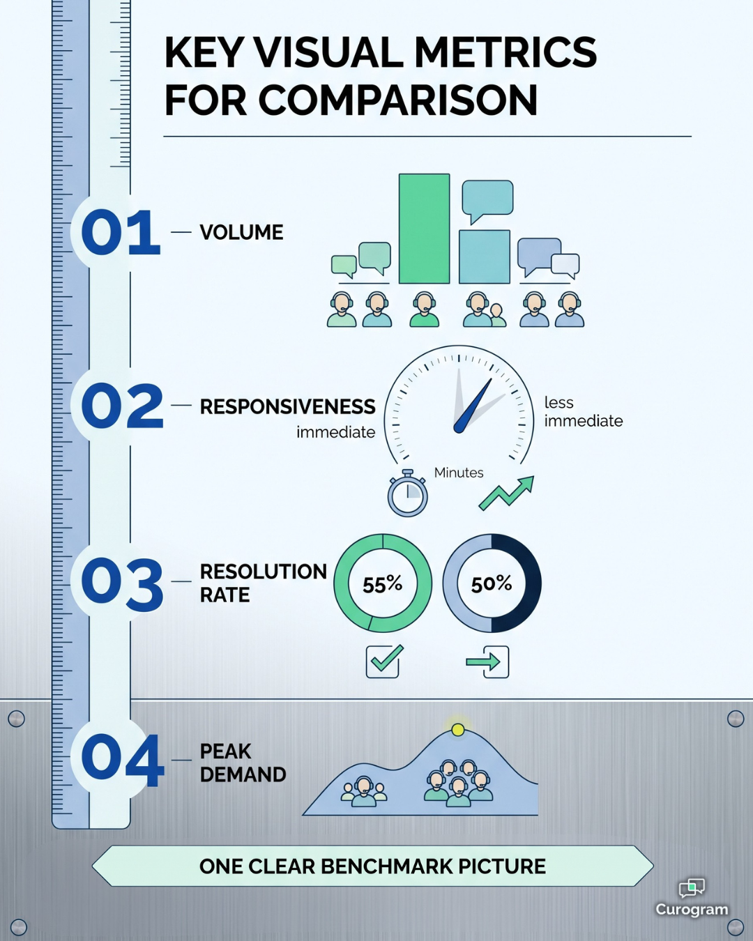
That is the gap this article closes. Benchmarking front desk performance across eClinicalWorks locations turns front office work into something you can count, compare, and act on. Volume by site. Median response time, resolution rate, and the hourly curves showing when each team gets buried.
Below, we look at why today's comparison fails, what a real network scoreboard measures, and what changes once staffing calls start with proof instead of noise.
The goal fits on a single line. Judge teams on the work they actually carry.
When the Loudest Location Wins the Argument
Front desk work is measurable in theory. In practice, almost nobody measures it.
Your phone system reports call counts, so calls feel like the whole job. They are not even half of it. A modern front desk also handles texts, form questions, reminder replies, recall responses, billing threads, and refill requests.
None of that shows up next to the call log, which means no site ever gets credit for it.
So managers fall back on the one signal they can hear: who complains. That single habit produces the unfair comparison sitting at the center of most multi-site groups.
Consider two clinics inside the same network, staffed identically. The numbers below are a sample scenario, not client data, but the shape of it will look familiar.
| Measure (monthly) | Northside Clinic | Riverbend Clinic |
|---|---|---|
| Front desk staff | 2 FTE | 2 FTE |
| Patient messages handled | 1,850 | 940 |
| Messages per staff member | 925 | 470 |
| Median first response | 9 minutes | 22 minutes |
| Threads closed same day | 88% | 71% |
Northside handles roughly 97% more messages per person and still answers faster. Riverbend has the quieter inbox and the slower clock.
Now guess which manager asks for help more often. It is usually the one with the spare minutes to write the email.
That extra 910 messages a month is not an abstraction. At 90 seconds of handling time each, it works out to about 23 hours a month, or roughly 273 hours a year. That is close to seven full work weeks of labor your reports never recorded.
The bill arrives in three ways. Staffing goes to the wrong site. Coaching goes to the wrong team. And your strongest people quietly conclude that effort is invisible here, which is one of the fastest routes to front office turnover.
This is why the fair workload comparison sites deserve has to begin with counting. Until then, every people decision rests on the weakest evidence available: who spoke up most recently.
One Scoreboard for Every Front Desk in Your Network
The fix is not a new policy. It is a shared instrument that counts the same things, the same way, at every location.
Curogram works as that network scoreboard. Texting, reminders, intake, and recall replies all move through one platform synced to eClinicalWorks. So the system already sees the full communication load, and measuring it becomes a byproduct of the work rather than a project on top of it.
What the views actually show
Curogram's practice analytics dashboard breaks down the work each site handles and how quickly it moves. You get messages handled, median first-response time, resolution rate, and volume curves by hour, split by location and by queue.
That last detail matters more than it sounds. A front desk response time metric averaged across every message type hides the story. Scheduling threads, billing questions, and refill requests move at different speeds for good reasons.
Queue-level views let you see them separately. That is also what makes message queue management clinic staff can trust possible, since each team sees which line is backing up instead of one blended number that explains nothing.

Why the eCW connection matters
A dashboard that only measures phone calls gives you a slice and calls it a picture. Curogram's link to eCW closes that gap, because reminders, confirmations, recalls, and intake all run through the same inbox your staff already lives in.
Practices using two-way texting this way commonly reduce call volume by as much as 50%.
When that shift happens, the work does not disappear. It moves.
Without a platform counting the new channel, your reports would show calls dropping and quietly lose track of everything that replaced them.
Coaching, not surveillance
The views are built at team level and oriented to trends, not individual keystroke tracking. Volume spikes, campaign days, and seasonal surges appear right alongside response times, so context travels with the numbers.
That context separates a fair review from a gotcha. A Tuesday with a recall campaign running is not a normal Tuesday, and the scoreboard shows that plainly.
What Changes When Managers Coach From Numbers
Once the counting is in place, four things change quickly.
- Response time becomes a managed number. Your network median stops being a mystery. It becomes a target you move on purpose, just like your no-show rate.
- Staffing follows workload. Volume per staff member across sites is the proof staffing requests usually lack. It works in both directions.
- Coaching gets specific. Instead of "be faster," a manager can point to the 2 p.m. spike at one location and build a coverage plan around it.
- Top performers become visible. The site closing threads fastest turns into a method worth copying, not a fluke nobody noticed.
Baselines help here. Across Curogram's client base, the average appointment confirmation rate runs above 75%. That gives every site a fair floor to measure against, not a target made up in a meeting.
For your team, that means a location sitting at 61% confirmation follow-through is no longer a mystery to argue about.
It is a gap with a size, and gaps with sizes get closed.
The same logic applies to speed. A response time SLA medical group leadership can genuinely enforce has to come from observed performance first, then get set separately per queue. Start with what your network does today, then decide what good looks like.
This is where operations coaching healthcare front office leaders provide stops feeling like opinion.
The conversation shifts from "who seems busy" to "who carries what," and that one change makes every decision after it easier to defend.
It also protects people. The overloaded team gets help before burnout instead of after the resignation. The efficient team gets studied instead of ignored.
And performance talks start from facts both sides can see. That is the only version of the meeting people leave feeling respected.
Staff coaching data multi-location groups can rely on does one more quiet thing. It ends the argument about whose location is harder, because the scoreboard already answered it.
Fairness Starts With Knowing Who Carries What
Your front desk teams are already being judged. The only open question is whether they are judged on measured work or on audible complaint.
That is the real case for benchmarking front desk performance across eClinicalWorks locations. Not surveillance, and not a scorecard for its own sake. An honest count of what each team handles, so your next people decision rests on something firmer than impressions.
Think of it as a division of labor between systems.
eCW runs your schedule and your chart workflow, and it does that well. Curogram runs the communication workload sitting on top of it, and finally makes that workload visible, comparable, and fair to coach against.
Here is a low-risk place to start.
Before your next staffing decision, pull one week of real per-location volume data. One week. Then put messages per staff member and median response time side by side.
That single week reverses the decision more often than managers expect. The site everyone assumed was underperforming turns out to be carrying the network. The site that asked loudest turns out to have room.
None of this requires a major change to how your teams work. Staff learn the platform in minutes, measurement happens automatically as conversations flow, and reporting arrives without anyone filling out a form about their own productivity.
What you gain is the ability to walk into a staffing meeting with numbers instead of narratives. That is a better meeting for you, and a far better one for the team whose effort finally shows up in writing.
Schedule a Demo with Curogram and we will walk through what two weeks of benchmark data typically reveals about a network like yours. Bring your hardest staffing question. The data usually has an opinion about it.
Frequently Asked Questions
The views are built at team level and focused on trends, not individual keystrokes. In practice, most front desk teams welcome them. It is usually the first tool that proves how much work they have been carrying all along, which tends to help them more than it exposes them.
It depends on the queue. A scheduling thread should move faster than a billing question, and holding both to one number helps nobody. The dashboard establishes your own network baselines first, then supports realistic targets set queue by queue.
Yes, and in both directions. Volume-per-staff-member comparisons across locations are exactly the evidence staffing requests usually lack. That same data sometimes shows a site is adequately staffed and needs a workflow fix instead of a new hire, which is just as useful to know.
One week gives you a rough shape. Two weeks is usually enough to see real patterns, because you capture both a heavy Monday and a slower stretch. Anything shorter risks reading a single busy day as a trend.
That is exactly why raw totals are the wrong comparison. Message volume per staff member, queue mix, and hourly curves let you account for the differences instead of ignoring them. A pediatric site and a specialty site will never look identical, and the goal is a fair read on each, not a forced match.