7 min read
Benchmark Front Desks Across Practice Fusion Offices
Aubreigh Lee Daculug
:
September 4, 2026
Curogram captures this automatically as patient conversations flow through one shared inbox synced to Practice Fusion. No time studies. No self reporting.
The payoff is a fair workload comparison across offices. Staffing follows real volume, coaching follows the evidence, and the quietly overloaded team finally gets seen instead of scolded.
Two of your offices look identical on paper. Same provider count, same front desk headcount, same hours. Same patient mix, same software running underneath.
One is thriving. The other is quietly coming apart.
You know this because of what reaches you: a manager who calls twice a week, and a supervisor who says "slammed" in every huddle. So the extra hire goes to that building, and the coaching conversation goes somewhere else.
Now the uncomfortable question. What if the office that never complains is actually handling twice the patient messages, and the team you just put on a performance plan is the fastest responding group you have?
You would not know it, and almost no owner in a multi location group does.
Front office work is one of the most measurable jobs in a medical group, and one of the least measured. Your phone system counts rings. Practice Fusion tracks the schedule and the chart.
Neither one tells you how many patient conversations a team actually carried yesterday, or how long each patient waited for an answer.
So decisions get made on impressions: who seemed stressed, who escalated loudest, and who happened to be in the hallway when you walked through.
That is not a management failure. It is a measurement gap. And in a small group, where a single hire reshapes the budget, guessing gets expensive.
Benchmarking front office performance across Practice Fusion locations closes that gap. Not with time studies or self reported logs, but with numbers your teams already generate by doing their jobs.
This article covers what a fair benchmark measures, why the usual comparisons mislead you, and how per office data changes the way you staff, coach, and defend your teams.
By the end, you will know exactly which week of data to pull first.
Why the Loudest Office Gets the Help
Front office work is one of the most measurable jobs in a medical group. It is also one of the least measured.
Your phone system counts rings and hold times. It does not count the text thread about a rescheduled physical, the reminder reply that turned into three questions, or the recall message that brought back a lapsed patient.
That whole layer of work is invisible, which is why location-level patient engagement reporting for Practice Fusion groups matters so much once you run more than one site.
Here is where it turns unfair. Two offices carry very different loads, and the quieter one usually loses the argument.
| What you notice | What is actually happening |
|---|---|
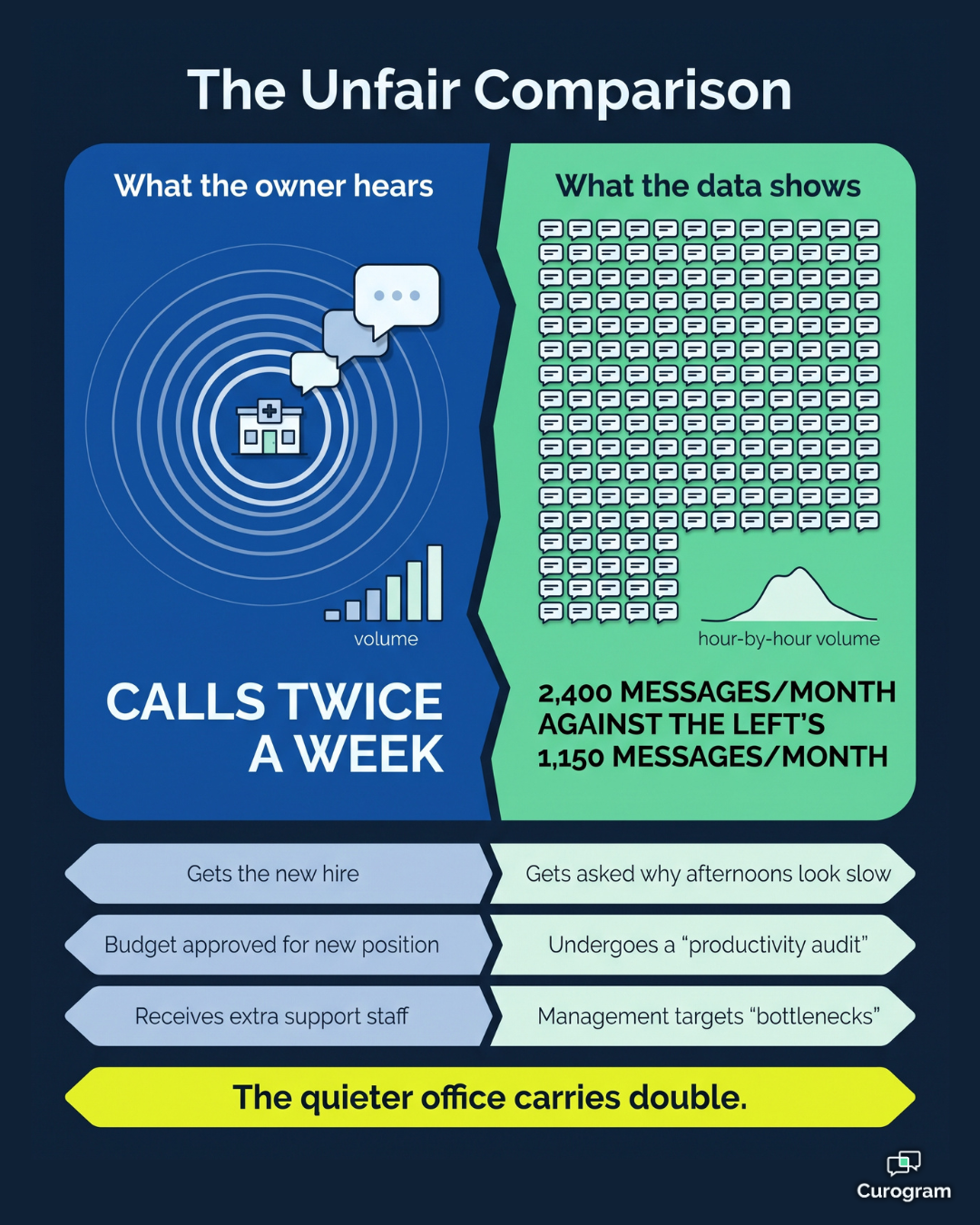
| Office A calls you weekly about being swamped | Handles about 1,150 patient messages a month |
| Office B rarely raises a hand | Handles about 2,400 patient messages a month |
| Office A gets the new front desk hire | Office B gets asked why its afternoons look slow |
| Office A feels validated | Office B starts updating resumes |
Those figures are illustrative, but the pattern behind them is not. Without message volume per office, you end up grading teams on volume anecdotes instead of volume data, and anecdotes always favor whoever is most comfortable speaking up.
The cost lands in three places. You hire into the wrong building, which locks in a payroll expense that solves nothing. You coach the wrong behavior, which frustrates a team that was already stretched.
And you slowly lose the people who were carrying the heaviest load without ever mentioning it.
That last one is the most expensive. MGMA benchmarking data put front office staff turnover at 40% across all practices in 2022, and front desk roles remain one of the most common churn points in medical groups today. Pay and scheduling get most of the attention as front office turnover drivers.
Feeling misjudged belongs on that list too, and it is the one you can fix without touching the budget.
In a lean group, this is the real problem. Your people decisions rest on the weakest evidence available: who complained most recently, and how convincing they happened to sound that day.

Building a Scoreboard Every Office Can Stand Behind
The fix is not another survey or a week of time studies. It is measurement that happens on its own, while your teams simply do their work.
What the Scoreboard Counts
Curogram runs your patient texting, reminders, and recall through one shared inbox.
Every message that moves through it carries a timestamp and an office. Workload gets counted as a byproduct of the work itself, so there is nothing extra for staff to log and nothing for anyone to fudge.
The Numbers That Matter Most
Team Performance Views give you four things, broken out by office and by queue. Messages handled, median first response time, resolution rate, and volume curves by hour.
That last one is quietly useful. It shows you when each site actually gets hit, which is rarely the same time everywhere. One office may drain its staff between 8 and 10 in the morning while another peaks right after lunch.
Median first response time is the number most groups are missing entirely. A front desk response time metric tells you something a call log never will: how long a patient waits for a real answer, measured the same way in every building.
Why the Practice Fusion Link Matters
Practice Fusion holds your schedule and your charts, and it does that job well. It was simply never built to measure conversation workload.
Because Curogram syncs appointments and patient records with Practice Fusion, reminder replies and rescheduling threads land in the same place as everything else. You get the full picture instead of the phone slice. The multi-location analytics dashboard is where that shared view lives.
Built for Coaching, Not Watching
This is the question managers ask first, and they are right to ask it. The views are team level and trend oriented, not a keystroke log of individual staff.
They also show context alongside the counts. A spike from a recall campaign, a snow day, or a provider calling out gets labeled rather than misread as a lazy afternoon.
That context is what makes a fair workload comparison across offices possible. Two teams can finally be measured against the same yardstick, with their real conditions attached to the number.
What Changes When the Numbers Lead
Once you can see workload, the conversation shifts from who seems busy to who carries what. That shift is worth more than it sounds.
Take the two offices from earlier, each staffed with two front desk employees. Split across roughly 22 working days, the math looks like this.
Office A: 1,150 messages a month works out to about 26 patient messages per person, per day.
Office B: 2,400 messages a month works out to about 55 per person, per day.
In practice, Office B carries more than double the communication load with identical staffing. No wonder its response times slip in the afternoon. That is not a discipline problem. It is a capacity problem, and you cannot fix a capacity problem with a performance plan.
Two numbers become manageable once you can see them.
The first is your group median first response time, which gives every office a shared target instead of a private guess.
The second is confirmation follow through, where a 75% or higher confirmation rate becomes the baseline each site is expected to hold.
Those baselines connect straight to revenue. Atlas Medical Center cut its no show rate from 14.20% to 4.91% in three months using automated reminders and two way texting. For a site running 600 visits a month, a single point of no show improvement is about 6 recovered visits.
At an illustrative $150 per visit, that is roughly $900 a month, or $10,800 a year, from one office alone.
This is the staff coaching data small group practices almost never have. It also works in both directions. When a manager asks for another hire, volume per staffer either supports the request or it does not, and the answer stops depending on who asks more persistently.
The human results matter just as much. The overloaded team gets help before it burns out. The efficient team gets studied instead of ignored, because now you can see which office answers fastest and go ask how they do it.
Coaching front desk staff with data turns a tense review into two people looking at the same screen.
Fair Management Starts With Real Numbers
Your teams deserve to be judged on the work they actually did, not on how audible their stress was. That is the whole idea here, and it is simpler than it sounds.
Practice Fusion runs your schedule and your charts. It does that job very well. But it was never designed to tell you how much patient communication each office absorbs in a week, or how fast that communication gets handled. Invisible work is always the easiest work to undervalue.
Benchmarking front office performance across Practice Fusion locations makes it visible. Message counts, response times, resolution rates, and hour by hour volume curves, per site, measured the same way everywhere.
Here is the practical next step.
Before your next staffing decision, pull one week of real per office volume data and compare it against your assumptions. Many owners find the numbers point somewhere they did not expect, and some reverse the decision entirely.
One week is enough to see the shape of it all. Two weeks is enough to act on.
If you are about to add a position, restructure a team, or put a front desk on a performance plan, that is exactly the moment to check the data first.
A hire in the wrong building costs you twice, once in payroll and again in the turnover you never saw coming.
Curogram was built alongside front desk staff, and most teams learn it in under five minutes. It works with Practice Fusion rather than replacing it, so nothing about your clinical workflow has to change.
Schedule a Demo and we will walk you through what two weeks of benchmark data typically reveals about a group like yours. Bring your own assumptions about which office is busiest, and we will show you exactly how to check each one of them.
Frequently Asked Questions
The views are team level and trend oriented, not an individual keystroke log. They exist to make workload fair and coaching accurate. In most groups, front desk teams end up welcoming it, because it is the first instrument that proves how much work they were actually doing all along.
It depends on the queue. A scheduling thread deserves a faster answer than a billing question, so a single number across everything would punish the wrong teams. The dashboard establishes your group's own baselines first, then helps you set realistic targets from there.
Yes, and that is one of its most common uses. Volume per staffer compared across offices is exactly the evidence staffing requests usually lack. It also works in reverse, showing when a site has room before you commit to payroll you do not need.
One week gives you a readable shape: rough volume ranking, peak hours, and obvious outliers. Two weeks is generally enough to act on, because it smooths out single day events like a provider absence or a large recall campaign.
No. Practice Fusion stays your system of record for the schedule and the chart. Curogram sits alongside it and measures the patient communication layer that Practice Fusion was never built to track, so your clinical workflow stays exactly as it is.