
.jpg) Mira Gwehn Revilla
Mira Gwehn Revilla
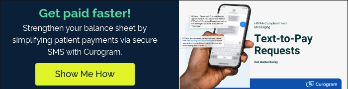
Dolphin Orthodontic Text-to-Pay: SMS Payment Links That Collect
💡 Dolphin orthodontic text-to-pay lets your practice send a secure payment link through SMS. Patients pay their balance in two taps, right on their...

Your billing coordinator pulls the Dolphin AR aging report every Monday morning. The same 30 names show up, week after week. She calls. Some pay. Most do not answer.
Next Monday, the list looks almost the same. A few new names join the old ones. The cycle repeats. Nothing changes.
This is the quiet pain of most Dolphin ortho billing teams. Your financial module shows who owes what. It does not show what happened when you tried to collect.
Did the patient get the statement? Did they open it? Did they call back? Dolphin can't tell you any of it.
That gap is where money leaks out of your practice. A Dolphin orthodontic payment recovery dashboard closes it. Curogram's dashboard tracks every step of your text-to-pay work. It follows each message from the first send to the final payment cleared.
You stop guessing which collection efforts worked. You start seeing which ones did. And you start fixing the ones that did not.
Based on our internal data, practices using Curogram for collection tracking lift their recovery rates by 20 to 35 points. Not because the tool sends better texts. Because it tells you which texts, which patients, and which follow-ups actually turn into real payment.
If your AR list feels like a treadmill, this is for you. Let's look at what a modern text-to-pay results workflow actually looks like in practice.
Dolphin's AR aging report is thorough. It shows every patient with an open balance. It sorts them by aging bucket: current, 30 days, 60 days, 90 days, and 120+ days. Your billing coordinator can see exactly who owes what, down to the dollar.
But the report is read-only. It shows the problem. It does not give you the tools to solve it.
There's no "text this patient a payment link" button next to each line. No "send a follow-up to everyone in the 60-day bucket" option. The report tells you the outstanding numbers. Collecting those numbers is a separate, manual job that lives outside the report.
Your billing coordinator has to copy names. She pulls phone numbers. She dials one patient at a time. Half the calls go to voicemail. The other half lead to promises that may or may not turn into payment.
Here's how the gap looks in practice at a mid-size Dolphin ortho practice:
|
Task |
Dolphin AR Report |
What's Missing |
|
See who owes |
Yes |
— |
|
Send a payment link by text |
No |
Must use a separate tool |
|
Track who opened the link |
No |
No visibility |
|
Log follow-up attempts |
Notes only |
No aggregate view |
|
Compare bucket performance |
No |
Can't spot trends |
When your coordinator prints the AR report and starts working it, nothing tracks the effort itself. Who was called? Who picked up? Who promised to pay? Who actually paid?
The notes live inside each patient's Dolphin record, one by one. There's no single view that shows the whole week. Nothing that says "you contacted 30 patients, 12 paid, 8 did not reply, and 10 need follow-up."
Without that view, every collection cycle starts from scratch. She pulls the same report. She sees many of the same names. She makes the same calls.
Without real collection analytics, your practice can't get better over time. You don't know the answers to questions like these:
These questions have real answers. Those answers can lift collection rates by 10 to 20 points. But when nothing is measured, the answers stay hidden.
Auto-pay is great, until cards expire. Dolphin shows the missed charge. It does not tell you why. Was it an expired card? A declined transaction? A canceled card? A bank issue?
Each cause needs a different message. Expired card means "please update your card." Decline means "try a different method." Without this split, your coordinator sends the same generic notice to everyone. The response rate drops.
Here's what your billing coordinator is really thinking most Mondays:
"I pull the AR aging report every Monday. Same 30 names. I call them. Some pay. Most don't answer. Next Monday, the same report has the same names plus a few new ones. I have no idea which collection attempts are working and which are wasted effort. I'm just calling the same list and hoping for different results."
This is not a staff problem. It's a tools problem. Dolphin was built to track financial records, not to run a modern collection workflow with measurable results.
Curogram's Payment Recovery Dashboard gives your billing team the visibility layer Dolphin's AR report lacks. The moment you text a payment link, the dashboard starts tracking. It follows each step until the balance clears or a follow-up is needed.
The tracked steps include message delivered, link opened, payment started, payment completed, and card updated. Each metric is sorted by patient, aging bucket, and collection cycle. You get the data you need to make your next round better than the last.
The dashboard's Aging Bucket Performance view shows collection rates by AR age. Your coordinator can see the full picture at a glance.
Here's a sample breakdown from our internal research on Dolphin ortho practices:
|
AR Aging Bucket |
Single Text Conversion |
With One Follow-Up |
With Two Follow-Ups |
|
0-30 days |
78% |
85% |
88% |
|
31-60 days |
55% |
70% |
75% |
|
61-90 days |
42% |
55% |
62% |
|
91-120 days |
30% |
40% |
48% |
|
120+ days |
18% |
28% |
35% |
This data drives smart triage. Focus first on the 30-day bucket where conversion is highest. Then put follow-up effort into older balances based on their expected yield.
The dashboard replaces gut-feel collection with real data. Your coordinator knows where her time pays off the most.
The dashboard flags non-payers from every campaign. One click sends a follow-up. No copying, no manual list-building, no guesswork.
It also tells you why each patient did not pay. The three common groups get different messages:
Each group needs a different tone. The dashboard lets you send the right message to the right person in seconds.

The dashboard splits overdue balance causes into clear groups. Expired card. Declined transaction. Missed auto-pay. Balance after insurance. Each one shows up in its own bucket.
This matters because each cause needs its own fix. Expired card patients get a "please update your card" text. Declined transactions get a "try another payment method" text. Balance after insurance patients get a short note that explains what insurance covered.
One generic message can never do all of this. The dashboard makes sure each patient gets the message that fits their reason.
For ortho groups running more than one Dolphin location, the dashboard shows every office side by side. Which office has the highest collection rate? Which one has the most AR stuck in the 90+ day bucket? Where is the expired card problem worst?
Your CFO or regional manager sees all of it in one view. No logging into each location's Dolphin instance. No spreadsheets stitched together by hand.
Here's what a sample multi-location view might show:
|
Location |
30-Day Collection |
90+ Day Collection |
Expired Card % |
|
Main Street |
82% |
45% |
12% |
|
Northside |
74% |
38% |
18% |
|
Westfield |
88% |
52% |
8% |
The gaps jump out. Northside needs help. Westfield's approach should be copied to the others.
Every part of the dashboard connects. The aging bucket view tells you where to start. The follow-up engine handles the next round. The cause detector tells you what to say. The multi-location view keeps leadership informed.
This is not a report. It's a working tool that gets sharper each week.
The true shift is not just better collection numbers. It's the change in how your team works every day. Collection stops feeling like a treadmill. It starts feeling like a system that gets better each cycle.
Let's walk through what that looks like in practice.
Based on our internal data, practices using Curogram's Payment Recovery Dashboard report collection rate gains of 20 to 35 points over phone-based work. That gap is huge in dollars.
Take a mid-size Dolphin ortho practice with $100,000 in 60-day AR. Phone-based collection might recover 35% of that, or $35,000. With the dashboard and smart follow-ups, the same practice hits 55% to 65%. That's $55,000 to $65,000 recovered from the same list. The extra $20,000 to $30,000 shows up every single cycle.
But the real value is not just a bigger number. It's the ability to see why the number grew. When you know a second follow-up text on day 5 lifts 60-day collection from 40% to 55%, you build that follow-up into every future cycle. The lift is not a one-time win. It becomes a repeatable pattern.
Before the dashboard, your billing coordinator's Monday sounds like this: "I'm calling the same list again." After the dashboard, it sounds like this: "I know exactly who needs what, and I can act on the whole list in five minutes."
Collection becomes a measured, fixable workflow. Not a weekly ritual of repeated calls. Her time shifts from dialing phones to studying outcomes and tweaking the approach.
This change matters for more than just the bottom line. It changes how your team feels about the work. Staff burnout from endless phone tag goes down. Staff pride in hitting real goals goes up.
Here's what a real Monday looks like once the dashboard is running.
Your billing coordinator opens Curogram at 8:30 AM. The main view shows last month's campaign at a glance.
Last month's numbers:
She clicks into the Aging Bucket view. The 30-day patients paid at 82%. The 90-day patients paid at only 38%. She sees which follow-up message worked best on the older bucket.
She selects the 10 non-payers. One click sends a custom follow-up to each group. Three patients who never opened the first link get a fresh send. Five who opened but did not pay get a gentle reminder. Two who hit a declined card get a new payment method request.
By Wednesday, 4 more patients have paid. That's $7,200 more in the door. The dashboard logs each payment in real time. No manual entry. No cross-checking with Dolphin.
She notices something useful. The 90-day follow-up converted 3 out of 5 non-payers when the message included a new payment plan option. She notes this for next month's campaign. The pattern is now a standard step.
What used to be a static AR aging report is now a learning loop. Each cycle teaches you something. Each lesson makes the next cycle stronger.
Here's the learning loop broken down:
|
Stage |
What Happens |
What You Learn |
|
Send |
Text-to-pay links go out to all flagged patients |
Which day and time get the best open rate |
|
Track |
Dashboard logs every delivery, open, and payment |
Which aging buckets convert fastest |
|
Follow-Up |
Non-payers get tailored second messages |
Which wording works on which group |
|
Review |
End-of-cycle summary shows totals by cause |
What to change next round |
|
Refine |
Standard approach gets updated |
How to raise the ceiling again |
This is the core shift. Your dashboard is not a fancy report. It's a system that teaches your team how to get better at collection.
Consider a Dolphin ortho practice with 200 patients on auto-pay. At any given time, about 8% to 12% have an expired card. That's 16 to 24 patients.
Without the dashboard, these expired cards turn into overdue balances. The billing team does not spot them until the next statement cycle. By then, they're 30 days late. Some become 60 days late.
With the dashboard, expired cards get flagged the moment a charge fails. The patient gets an immediate "please update your card" text with a secure link. Based on our internal research, 60% to 75% of expired card patients update within 48 hours when prompted this way.
That's 12 to 18 of those 24 patients fixed before they ever become AR. The other 6 to 12 get a follow-up on day 3. Most of those resolve by day 7.
The downstream effect is huge. Expired card cases that used to sit in the 30-day bucket never get there. The older buckets shrink too. Your whole AR aging curve moves to the left.

How Curogram's Payment Recovery Dashboard Fits Into Your Existing Dolphin Workflow
Curogram is not a replacement for Dolphin. It is the visibility layer that makes Dolphin's AR data useful for real collection work. The two systems work side by side, not against each other.
Your Dolphin financial module stays as the source of truth for balances and aging. Curogram reads that data and turns it into trackable text-to-pay campaigns. When a patient pays through a Curogram link, the payment flows back into Dolphin. No double entry. No reconciliation headaches.
Staff training takes 10 minutes or less. That's a Curogram promise we keep across every product. Your billing coordinator does not need to learn a new platform from scratch. She sees the dashboard, clicks a few buttons, and starts seeing results within the first week.
The payment links themselves are HIPAA-compliant by design. Each text redirects patients to a secure page where they enter card details. No protected health details ever travel through the text message itself. This keeps your practice safe and your patients confident.
The dashboard works across all Dolphin platform versions. Dolphin Desktop, Dolphin Cloud, and Dolphin Blue are all supported. Multi-location groups running different versions at different offices still get one unified view.
Pricing is simple and focused. You pay for text-to-pay, collection tracking, and the dashboard. You don't pay for VoIP or review tools or other bundle items you may not need.
Setup takes less than a week for most practices. Your Curogram team handles the integration. Your staff handles their first campaign. By week two, the dashboard is showing real numbers from real patients. By month three, you're seeing the 20-35 point collection lift our other practices report. No long ramp. No wasted months.
Dolphin's AR aging report shows what patients owe. It does not show what happens when you try to collect. That gap costs your practice real money every single cycle.
Curogram's Payment Recovery Dashboard fills that gap. It shows who received the payment link. It shows who paid, who did not, and what follow-up will recover the rest. Every text-to-pay touchpoint is tracked in one place.
The shift is simple but powerful. Dolphin manages your financial records. Curogram makes those records actionable. A static AR report becomes a dynamic collection workflow. Weekly calls become a data-driven strategy that gets sharper each cycle.
You don't need the full Weave bundle to get there. You don't need a platform overhaul. You need the visibility layer that fits on top of the Dolphin you already run.
Your billing coordinator's Monday morning is about to look different. Fewer repeat calls. More cleared balances. Less guessing, more knowing. The AR list that used to produce anxiety will start producing outcomes.
Stop guessing what your next Monday looks like. Schedule a demo and let us show you a side-by-side of your current collection workflow versus one powered by the Curogram dashboard.

💡 Dolphin orthodontic text-to-pay lets your practice send a secure payment link through SMS. Patients pay their balance in two taps, right on their...

💡 Curogram's text-to-pay helps Tebra billing teams collect patient balances in hours instead of months. It replaces the costly paper statement...

💡 Curogram automates DrChrono patient balance collection so billing staff stop wasting hours on phone tag. Sends an automated balance alert text...